Timing is Everything: How to Optimize Social Media to Your Advantage

By | Uncategorized | No Comments

Social media has quickly become the be-all and end-all of marketing outlets. Depending on the audience, other means of communication are still important. However, almost every audience is involved with social media. It’s therefore a sure fire way to spread the word.

The problem is figuring out how to post in a way that will grab attention among the millions of others out there seeking the same eyes. The trick is: timing. If something is posted at a time of day when your audience will not be online, then it goes unseen.

Not only are there certain times of the day when posts are more likely to be read, but there are also times of the day when posts are more likely to be shared. Figuring out what those times are can take companies from desperately posting to dominating feeds fast.

Below are timing strategies that will ensure marketing success for every main social media outlet.

The Social Media King: Facebook

The best times of the week to post marketing material on Facebook are Thursday and Friday. At the beginning of the week most people are motivated to get work done. By the time things wind down with the weekend pending, minds start to wander.

However, by the time the weekend actually hits, no one wants to sit at a computer any longer. 86 percent of Facebook posts happen during the work week. Although engagement rates are better on Thursday and Friday, and the average falls by 3.5 percent Monday through Wednesday, a work week post will still trump a weekend post. 

Not only are eyes important, but moods hold weight as well. Finding a time when your audience is happiest will make it more likely that they share your posts. The happiness scale goes up 10 percent on Friday.

Now what about time of day? The best time to post on Facebook is in the early afternoon. The most shares will occur at 1pm while the most clicks will happen at 3pm. Depending on the type of action companies want out of a post, they should choose one of these time slots.

Don’t forget, however, to always remember who your audience is. These suggestions apply to the general public, but it may vary depending on who you are trying to reach.

Real Time is Optimal Time: Twitter

Things are a bit different for Twitter posts. The best time to post marketing material on Twitter just so happens to be the weekend: Saturday and Sunday.

Again though, this depends on the audience at hand. When attempting to communicate with another business, weekdays are 14 percent more likely to have success than weekends. It’s the customer communication that should take place on the weekends.

Since Twitter is primarily sought after on handheld devices, it is easier to use while out and about. People are more likely to engage with companies on Twitter if they are relaxed and have time for fun.

As for the time of day to post, 5pm receives the most retweets while 12pm and 6pm have the highest click through rate. It is smart to factor in a commute as well. If your audience has a daily train ride with an hour of free time, remember that they are 181 percent more likely to be on Twitter during that time.

The Professional Network: LinkedIn

LinkedIn is primarily a business social network. It just makes sense that people are more likely to engage with companies on this outlet during business hours. Therefore, the best time to post on LinkedIn is Tuesday through Thursday during work hours.

When asking the question: which work hours are the best—simply think logically. Most people check their personal outlets when they first arrive at work and right before they leave. It is reasonable then that 7am-8am and 5pm-6pm are the absolute best times to post.

However, if clicks and shares are what you want, Tuesdays from 10am-11am prove best. While this type of audience may be less of a direct marketing campaign for companies, using LinkedIn is a great way to reach influencers. These contacts can be the ones to carry your marketing campaign for you.

For the Recreational Audience: Pinterest

Pinterest is perhaps the least  professional outlet of them all. However, it does serve its purpose and it serves it well. Using this outlet with an audience that consists of women who enjoy cooking, shopping or crafts is a smart move.

If shoppers are what companies want, then pin on Fridays at 3pm. That is when the fashion retail lovers are buzzing the most. However, in general, the best time to post on Pinterest is on Saturdays between 8pm-11pm and 2am-4am.

Pinterest is a late-night hobby that most people jump on at the end of a long day. Weekends prove to be the best for companies to post marketing material because no one has to get up early in the morning. Therefore, any late-night pins are also guilt-free. 

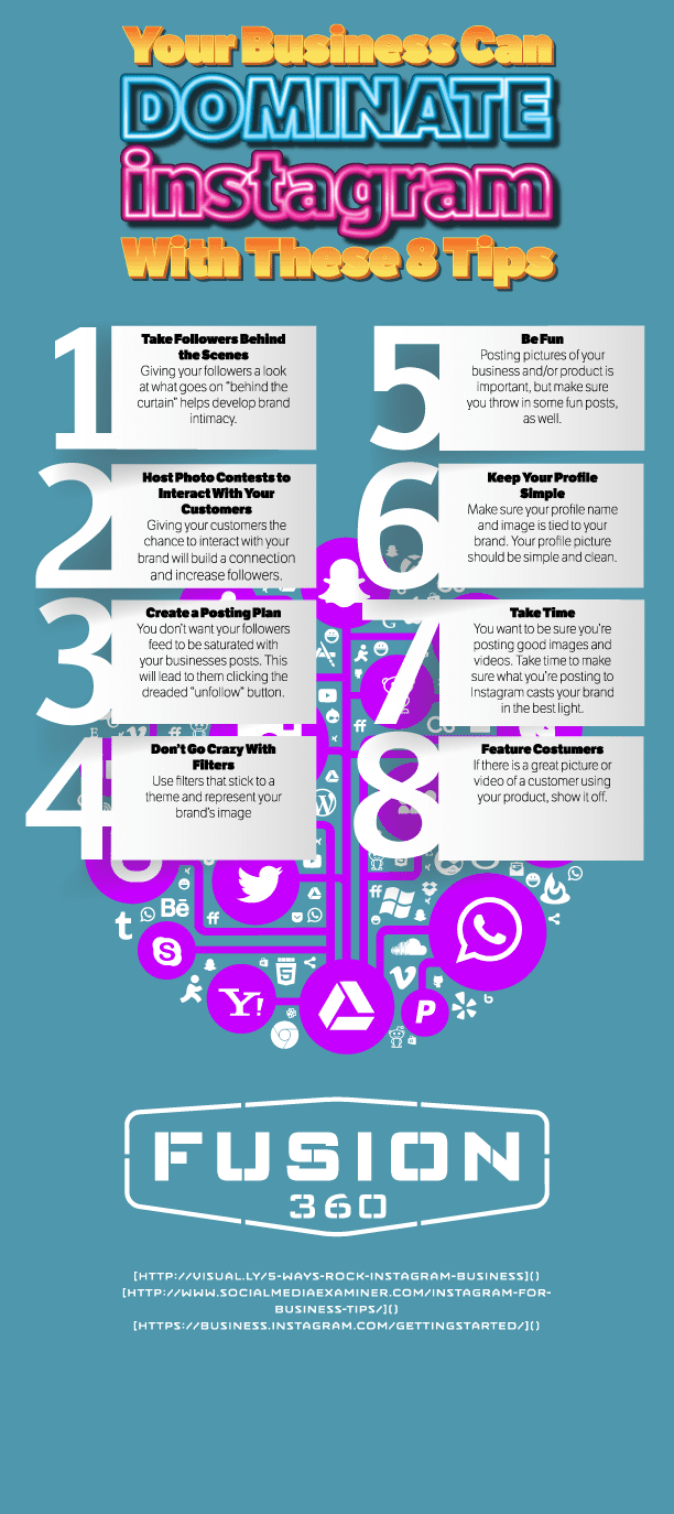
The Artsy Types: Instagram

Another outlet on the fluffier side of things is Instagram. This outlet is becoming more and more popular in today’s hipster-fashioned world, especially among teenagers. If the artsy types are the audience at hand then Instagram is the key.

Since Instagram consists of short posts with pictures as the main attraction, posting stays consistent pretty much all week. Slight spikes take place on Mondays and small dips occur Sundays.

For Instagram, work hours are not its friend. 22.5 people per 1,000 Instagram followers interacted with posts during work hours while 33.4 interacted with companies during off work hours. Instagram usually pops up when someone wants to share an experience. Let’s be honest, what crazy happenings go on in the workplace? Post marketing material on off hours to receive the most engagement.

Don’t Take Timing Lightly

Social media marketing may seem easy because it doesn’t require much effort. What it does require, however, is strategy. Timing should always be incorporated in that marketing strategy for companies to see success.

Mobile Sites: Features Every Web Developer Must Include

By | web development | No Comments

Whether it’s a site made specifically for cell phones or not, every website now needs to be adaptable for mobile devices. However, handhelds read a lot differently than large computer screens. That means that web development adjustments must be made.

Keeping that in mind, what are these necessary adjustments? Which changes are most important and which ones can be overlooked? Below are nine mobile-friendly features that must be included in order to keep handheld viewers coming back:

Buttons That ‘Click To Call’

Millennials love to have everything right at their fingertips. Mobile devices are a big part of what makes that possible. Technology has also shortened the attention span of frequent users. That means if something is too difficult to access, they have no problem giving up and finding something that can satisfy their needs quicker.

Most people nowadays also don’t travel to check out a store or product. They will call first, make sure they can find what they’re looking for at the location and then make the trip out there. This makes “click to call” or “click to SMS” buttons imperative.

Don’t forget during web development that the easier a navigation process is, the better. More people will inquire after your product or service if “click to call” buttons are included.

Lay Out Directions

Once a viewer does decide they want to take the next step and visit your store location, it should continue to be an easy process. Include a mobile map in web development that can easily guide potential customers to you without any hassle.

This can be done by including a Google Maps widget. Also be sure to include step by step directions along with the map itself so that customers won’t give up and turn the car around.

Keep Contact Forms Simple

Although most will simply call a company to make an inquiry, some people prefer email or contact forms. Make contact forms as short and simple as possible so that again, contacting you is not a hassle. Difficulty is one of the top things that will turn away interested but flighty customers.

Web development should revolve around simplicity. Especially in regards to how a customer can contact personnel. The easier and faster it is for them to accomplish their goal, the more likely they will be to return.

Create Collapsible Content

Content should also follow the principle of simplicity. It is easy to get carried away with too much information during web development. Although it all may be important, choose the most relevant information to feature first.

Then, use collapsible content so that users don’t have to scroll down the page at all. This way one touch of a minimize button can bring up new content without cluttering the screen.

Tricks To Easy Navigation

Once a customer decides they want to explore past the home screen of a website, navigation should be effortless. One way to do this is by including a “back” button at the bottom of each page. Also, make links or other pages bold and pop out  so that there is no doubting buttons are buttons.

Don’t just focus on the homepage aspect of web development. Make sure that every single page is easy to explore, and that all signs point to home. It shouldn’t be difficult for customers to get back to the main page.

Include Video Content

Another part of the millennial generation that is taking over the technology world is video. Millennials (and most people for that matter) are stimulated by sight. They connect better with images flashing on a screen rather than words.

Videos not only grab attention, but they are more successful at holding that attention too. 41 percent of users prefer video over text. Even if it is just an introduction to your company or product, include at least one video in web development.

Make Buttons LARGE

As discussed before, navigation should be easy. That means you should make buttons bolder and bigger. If it is an important button that will spread the word about your site, make it bigger than the others. It will more likely catch the eyes of browsers that way.

Social media links should especially should not be hidden. Use the logo for each social media outlet and make it look like a button that when customers click on, it will take them right to the outlet. Specifically, buttons should be designed during web development to be between 45 and 57 pixels.

Don’t Forget the Link

Although you may already be planning to include “back” or “home” buttons in your web development, don’t forget to include the entire link. This way if someone wants to copy and paste or open your website in a different browser, it is uncomplicated.

After including all of these important features, remember that usability is key. Simply ask yourself if anyone could get frustrated while using your site on a mobile device or otherwise. If the answer is yes, then it’s time to rethink your web development.

Fusion 360 - 9 Necessary Features for Mobile Sites (Fusion 360 Web Development)

Marketing Your Startup From the Ground Up

By | digital marketing | No Comments

Building a company is many things, but one thing that it will always be is a challenge. There are numbers to crunch, people to hire and products to build. With all of that to consider, sometimes Entrepreneurs miss the most important part: marketing.

Learning how to market your company can be the very thing that makes it successful. Although the rest is important, without marketing there will be no customers; without any customers, there would be no sales; and without sales, there will eventually be no more business. That’s why learning the tricks of startup marketing is not just important—it is vital.

Keep Company Goals in Mind

Before anything is solidified within new companies, they first must set goals. Both short-term and long-term goals will set the standards for future actions within those companies. Therefore, these same visions must be kept in mind when entering the marketing phase. Understanding the purpose of the startup will direct a company towards the right key publics, deciding which consumers are the right consumers to target. Zeroing in on a few specific types of people is important. If a company attempts to market to everyone they will usually find themselves left with no one, especially with the limited resources of a startup.

Figure out which types of consumers would be most likely to fulfill the goals of the company. What kind of person would buy your product or use your service? Once you figure out who your audience is, learn everything there is to know about them. This will then guide the rest of the marketing process because different consumers obtain their information in different ways.

Piggyback On Partnerships

When it comes to a starting a business, the best way to learn is from those who have already been through the same exact thing. Find established companies with whom you can partner with. Find out how you can help their company and they will most likely be happy to help yours in return. These companies can not only act as a mentor but can feature your product on their blog or website that already has solid followers.

Make sure to find a company, however, who fits in with your personal brand identity. It is better to learn from someone in the same industry. Also, it is important to partner with a company who is trying to reach the same audience as you. This way it will make it easier to reach out to your key consumers. Associating with a well-known and well-loved company can be the “in” that establishes your startup as noteworthy. If the big-wigs thinks it’s cool, then it must be.

Developing Content and Establishing a Brand

Perhaps the most important part of marketing a startup is creating content that will stick. Consumers want content that relates to their lives and is interesting. Establishing branded content will help any startup connect with their target audience. The brand must be something that the audience feels they can connect to and be a part of. Gone are the days when selling a product was about convincing people; millennials now want brands that allow them to join in and become involved.

The best way to do this is to avoid promotional content. Companies need to discuss topics within the industry or present interesting findings to consumers who care. Provide legitimate information that gives the chance for consumers to join in on the discussion with companies.

Don’t Forget Social Media

In order to give consumers that chance to converse, companies must have a presence on social media. This may seem like a no-brainer since it is a free and easy way to get in touch with target audiences. However, it may be so easy that some companies put their focus elsewhere. Don’t forget that social media is one of the main communication channels of the modern age. It is now how people receive information every day. Not only that, but it provides an easy route to reach out to specific influential people in the industry and spark discussions.

Strive For a Viral Status and Incentivize Sharing

Take that social media to the next level by striving to make content go viral. This is a step that will come later for startups as it may not be easy to even gain the eyes of the target audience at first. Once a company becomes a little more established, however, think of ways to make content spiral and spread. This can be done through contests, urging people to tag or share with friends, holding events or extending questions in need of response. Keep the “sharing” goal in mind while developing content. Think about whether your consumers would not only be interested in the content, but would also be motivated to share it with their friends and family. That will eventually extend your brand to multiple publics, reaching the eyes of millions.

Keeping marketing in mind throughout the adventure that always comes with building a company from scratch is vital. There may be a lot to do, but don’t forget that marketing will eventually be what brings your company success.

Keep Viewers Engaged: The Must-Haves of Web Development

By | web development | No Comments

Making a website look cool may seem like the perfect way to capture the attention of web browsers around the world. Maybe it is—but it is not how you get those browsers to stick around. Flashy pages may draw people in, but it is the content that will keep them engaged.

The number one way to keep viewers engaged is to keep them on the site longer. How do you go about convincing viewers that your site is worth the stay? Below are a few simple ways to take your site from trashy to trusted.

Keep Content ‘Above the Fold’

While many may think that keeping content “above the fold” is an age old practice meant for print media, it is still relevant online. “Above the fold” generally meant that the most important information was placed on a newspaper above the line where the paper naturally folds. That way people would see the most important information first and get drawn in to read more.

However, with web development it is still imperative to keep the information that is the most important above a certain point. Rather than a fold line, though, it will be a scroll line. Before the viewer has to scroll down the page at all, the content should be interesting and relevant enough to reel them in. That way, their glance over will cause them to stop and want to stay for more.

80 percent of viewers spend their time on websites without any scrolling. What does that tell you about technology users? They waste no time. Providing the most important information first during development will make viewers feel like your website is worth their time and will continue reading.

Incorporate Videos

With the rise of millennials came the rise of video in content marketing and web development. Technology has made everything faster, encouraging real time updates and anything that caters to short attention spans. While the number of people who read text Online has gone down, the number of people who watch videos has gone up.

Viewers retain 95 percent of content when they watch videos but only 10 percent when they read text. If you are worried about keeping eyes on your website longer, videos are the solution. They require eyes to stay on the site for a longer period of time, giving you more opportunity to peak interest and turn viewers into consumers.

After all, YouTube is the number two search engine in the world. That means that videos have a way of getting to people. There are a few reasons for this. In Susan Weinschenk’s research about customer psychology, she outlines four reasons why video works:

  1. The Fusiform Facial area makes viewers pay attention to faces because our brains are hardwired to believe human faces more than words on a page.
  2. The sound of a voice makes content more meaningful and adds needed color to text.
  3. Emotions and body language are actually contagious. Watching someone else feel a certain way about a product or experience can change the viewer’s own opinion.
  4. Movement is eye catching. It grabs viewers’ attention and holds it there long enough for intended messages to get across.

Using video is becoming common place in the marketing world. Involving it into your web development is imperative. Any site without video is voluntarily lagging a few steps behind everyone else.

Start With Minimalism

Some may think that people like choices. Well, that’s not necessarily true. Why do you think companies like In-N-Out with a 4 item menu or Apple with such uniform products have success? It’s because people like to be told what they want while still feeling that they have the freedom to choose. No one wants to be overwhelmed.

The trick is to be simple. Use minimalism in your web development that is pleasing to the eye and easy to read. On average, only 28 percent of website copy is read. Scanning has become the norm.

Using minimalistic design also forces every website to only include the important items. This will make it easier for certain messages to translate over to viewers. They will know exactly what a company is trying to say because the message won’t be hidden beneath unnecessary information.

Use Congruent Stylistic Techniques

Just as viewers don’t want to be overwhelmed with information, they also don’t want to be overwhelmed with too many different colors or designs. Choose a set color scheme for the website and use it consistently throughout web development.

Using the Adobe Kulur tool can easily solve this problem as it helps designers choose a scheme and lays out all of the colors that can play into that scheme.

Improve Loading Time

Going back to the short attention span phenomenon that permeates the modern age, loading time is an important factor. Viewers want to see the page almost instantaneously, and if something takes too long to load, they will have no problem leaving.

In fact, four out of five online users will leave a website if it takes too long to load. That’s 80 percent of viewers. Losing 80 percent of viewers is a big price to pay for such a small problem.

According to surveys by Akamai and Gomez.com about half of users expect to have the page loaded in two seconds. If it takes past three, they usually bail. Don’t worry, Google developed a tool called Page Speed Online so any web developer can measure the speed of their page and improve development.

Separate Hyperlinks

Hyperlinks may not seem like a big deal as long as they are included, right? Well, apparently those sites that change the color of hyperlinks from when they haven’t been clicked on to when they have been clicked on have proved to be more effective. 

Making sure hyperlinks work is vital in web development, but separating the color based on click status is something that viewers like to see. It is helpful to the user which will ultimately benefit the web developer.

Always Include Search Bars

Search bars are a must-have for any web development. They may almost be more important than hyperlinks because it allows a user to easily navigate through a website. If a viewer comes to a site looking for something specific and can’t find it, that could cause them to give up altogether.

Search bars should be large enough to incorporate 27 characters which allows users to search up to 90 percent of their questions. This way potential consumers will have a greater chance of actually sticking around because they know that they can find what they need.

Make it Different

Although it may not be the most important technique to keep viewers engaged, it will initially reign them in. Using a unique design on web development will help viewers to feel connected to a website and find personality within a brand.

Avoiding stock images and instead use an original design in web development that will leave a lasting impression. This will ensure that users will not only be drawn to the website but will want to return. Make sure this is the cherry on top, however. Just because a website is flashy, doesn’t mean it will convince viewers to stay. Combine style and strategy for a website design that will last.

Fusion 360 - How to Keep Visitors Engaged on Your Website (Fusion 360 Web Development)

7 Ways to Make Your Online Content More Readable

By | SEO | No Comments

Whether you make your living as a web developer, copywriter or SEO specialist here in Utah or elsewhere, it’s imperative that any and all digital content be made available for mass consumption in a presentable fashion. Unfortunately, we’ve all had the displeasure of visiting websites that were riddled with complex interfaces, poor site navigability and—perhaps most troublesome—indigestible content, regardless of whether it be editorial or visual.

In order to make a website work for you, your respective clients and the World Wide Web’s most influential search engines, take the necessary time to make certain that content—particularly of a written nature—be readable, enjoyable and provide something of concrete value for site visitors. Still confused? The following infographic promises to simplify the tricky endeavor:

Fusion 360 - 7 Ways to Make Your Online Content More Readable (Fusion 360 SEO)

How to Manage Negative Social Media Comments

By | Social Media | No Comments

For social media marketing agencies all over the country, managing digital communities is just another part of the job. Whether it’s strategically starting a conversation on an industry-specific forum or using Audience Insights on Facebook to better understand what your target demographic desires, dealing with the mass amounts of social users can, after a bit of time, become a commonplace, comfortable affair.

That being said, regardless of the amount of time that you’ve spent as a social media marketer, dealing with negativity on any platform can be a troublesome endeavor. Making the matter even more difficult, you don’t represent yourself, but a client whose loyalty you’re trying desperately to gain.

However you handle marketing-related crisis, remember to take a deep breath, relax and respond appropriately. For more priceless help, check out the following points of emphasis which promise to make dealing with social marketing negativity an easier task:

Learn From What’s Taken Place

Negativity and harshness can be hard to deal with, even for the most seasoned of ad agencies. In real life, everyone has gone through situations in which they’ve been faced with public disapproval or a cutting comment. Even though social media is distanced in its interactions, the bravery with which people—all while hiding behind a selfie-centric profile picture—attack others is tremendous.

Instead of getting defensive by way of a few hateful backlashes, choose to read the comment in question a few more times. Try to see things from his or her perspective and think of how genuine help can be provided. Furthermore, it’s always a good idea to document negative comments for training or to follow up on later. Screenshots work perfectly for this and should be used accordingly.

Avoid the Temptation to Delete

There’s this crazy idea that once something’s been deleted, it permanently goes away. While the lunacy of such an ideology couldn’t be more apparent, when social media marketing and its respective agencies are involved, there’s an added level of naiveté. Countless are the stories of movie stars, musicians, athletes or common people who’ve been lambasted by something that they said weeks, months and even years prior through social media. Truthfully, that’s a heavy responsibility to have to deal with on a daily basis, but social marketing managers must find a way.

Needless to say, as opposed to immediately deleting a comment which unfairly casts a negative light on your client, choose to tackle the issue head-on, as top-tier agencies always do. Direct messaging options help to make this kind of resolution a private matter and can be extremely helpful.

With that in mind, from time to time, inappropriate comments will need to be deleted if profanity, racial slurs, explicit sexual content or anything else of the sort are put on display for all to see. At the end of the day, your best judgement will need to come into play to make the right decision.

Timeliness Can’t Be Understated

Any and all reputable marketing agencies understand the importance of deadlines. Without them, accountability ceases and clients opt for other industry competitors to handle their product- or service-pushing needs. In a similar fashion, social users—while unpleasant, from time to time—deserve to have their concerns addressed in a timely fashion.

In fact, studies have shown that, over the years, active social media enthusiasts have come to expect a response within only an hour of an initial engagement attempt. When comments are deleted or ignored by agencies, audiences may feel that something is being hidden from them. Simply put, the sooner a problem can be addressed, the better.

Respond In a Calm, Collected Manner

In an ideal world, all social interactions would be filled with glowing reviews and words of kindness. Seeing as how they aren’t, a change in perspective is often required to put a positive spin on things. Disparaging posts or tweets can’t be seen as an insurmountable obstacle; moreover, a way to transform an annoyed customer into a happy one.

Provide as much information as possible to help bring about a solution. Oftentimes, in certain scenarios, a special offer or outside email can make things right. In more extreme cases, if a complaint is genuine, help connect the miffed party with the best person to help them.

Regardless of who you are or how long you’ve been working at any one of America’s many marketing agencies, negativity is unavoidable; it’s never going away. Instead of turning the proverbial cold shoulder, ignoring the situation or making it worse through a series of harmful replies, take control and build your brand’s reputation with smart social practices.

Fusion 360 - How to Manage Negative Social Media Comments (Fusion 360 Agency)

Coming to Better Understand ‘Content PR’ In the Digital Age

By | content marketing, public relations | No Comments

Defining the subtle differences between advertising, marketing and public relations can be a difficult endeavor, even for the country’s most successful ad agencies. While answers certainly exist as to what barely separates and drives the booming communicative fields, most communications professionals have always felt that—on the flip side of things—content marketing and digital PR were held at opposite ends of the spectrum by way of huge distinguishing factors.

In reality, however, the overlap is prominent, to say the least. In fact, so joined at the hip are the two practices that—sooner, rather than later—you’re bound to hear the term “Content PR” being tossed around down at the office. Needless to say, whether it’s content marketing or digital PR that you consider your God-given forte, there’s bound to be a heavy mixture of both advertorial tactics.

As an improved spinoff of traditional marketing, content marketing is focused primarily on the creation and distribution of meaningful content which, when consumed, both engages and acquires a target audience. Interestingly enough, PR strives to do something very similar: build rapport and trust with a predetermined demographic. In time, as the aforementioned specialties continue to evolve, the dividing line of separation between content marketing and PR promises to become thin.

Distribution Is Just as Important as Production

Does the term “churnalism” ring a bell? You might’ve heard it mentioned a few times during an introductory journalism course in college or while working an entry-level gig at any one of America’s many ad agencies. “Churnalism” refers to a writing style that’s centered on quantity, rather than quality.

When done properly, content marketing needn’t be an activity in speedwriting; moreover, an exercise that aims to examine the questions and concerns of consumers—a very PR-driven concentration, in its own right—and address them through published content. Sure, production is important for content marketing to take effect, but it means absolutely nothing without sound distribution techniques.

This is where PR comes into play for marketing agencies. Content marketers and their respective agencies tend to allocate the majority of their publication efforts towards channels that they rightfully own and manage. Owned media helps with long-term growth, search-engine rank and becoming an industry-specific thought leader, but there’s more out there to be discovered.

On the other hand, PR spotlights the importance of earned media. Of the matter, says ContentMarketingInstitute.com, “Key elements of marketing are to attract an even greater audience, lead pool, and increasing brand awareness. While content marketing beefs up one’s owned-media outlets, PR bolsters earned media and likely garners new eyes for a brand.”

Brand Reputation Is Strengthened With Every Link Hit

Blogs are important and most content marketers already know it. They have to know it, seeing as how they spend countless hours crafting engaging posts for both blog subscribers and those who might stumble upon their site through random Google searches or social posts. With that in mind, however, blogs aren’t necessarily the most important thing for content marketers and the agencies at which they work.

Let’s say, for example, that the CEO of your tech startup has a new app update that he or she would like to announce to the world. Obviously, a well-written blog post should be crafted to help get the word out. When shared through a company’s numerous social platforms, people are going to learn not only what said update is and how it can help them, but how they can get their hands on it.

That being said, blogs aren’t always the perfect solution for agencies. The problem with blog posts lies in the fact that there’s a certain self-serving stigma that surrounds them. Now, imagine if The New York Times or The Wall Street Journal wrote a piece on your startup’s newest app update. Not only would more people know about it, but they’d be more inclined to believe that such an update could really help them. If this sounds like a worthwhile pursuit, go nab your closest PR representative and get to work on gaining coverage.

Content Marketers Must Think About the Bigger Picture

Writing purists will argue that the world’s greatest authors wrote, write or will write for writing’s sake. This sort of utilitarian approach is fine, but usually there’s a greater good that’s being accomplished. In the case of the aforementioned authors, making a living, providing for loved ones or presenting an important message all might take the proverbial cake as a main motivating factor.

As far as agencies are concerned, content marketing is no different. At its core is a heavy editorial skill set, but there’s so much more that’s being accomplished through the strategic writing process that’s often forgotten. Content marketing agencies must remember that they’re not writing to meet deadlines or to fulfill a quota; they’re working to better serve digital audiences healthy doses of incredible stories, industry-shaping news and groundbreaking ideas.

More often than not, PR helps content marketers fine-tune the emphasis being placed on the public. In the process, fresh insights, new angles and creative perspectives are formed and implemented.

Truthfully, it shouldn’t matter if it’s a basic blog composition or a bit for The Huffington Post, if a target group is kept in mind right from the very start, the end result will be worthy of everyone’s time and energy. With a similar goal driving both content marketing and PR, it won’t be long until “content PR” becomes a mainstay of any communications team.

Fusion 360 - Coming to Understand Content PR (Fusion 360 Agency)

Vine: Building a Brand In 6 Seconds or Less

By | Social Media, video production | No Comments

In just a couple of years, Dom Hofmann, Rus Yusupov and Colin Kroll—the original creators of Vine—have proven that being long-winded isn’t necessary to get a message across. Seriously, it only takes six seconds or less. Still not convinced? As of April of this year, Vine—a short-form, video-sharing smartphone app— had managed to attract over 40 million registered users.

With upwards of 12 million Vine videos being uploaded to Twitter and other social platforms each and every day, it’s hard to argue against the strange, yet successful amateur video production outlet. Sure, it’s fun to watch miniature videos of house cats making fools of themselves or young, unsuspecting fathers taking a wiffle ball or two to the groin, but is there any real video production or social media marketing value with Vine?

Seeing as how more than half a trillion Vine loops run annually, the answer to the aforementioned question is a positive one. With that in mind, however, there are certainly better, more approachable methods for making Vine an effective tool for brand building. The following are a few of the more prominent strategies:

Product Demos

Nowadays, it seems that most people prefer online shopping over having to actually get up and go to a nearby store. While true, it’s much harder to purchase an item without the luxury of having it right in front of you. Simply put, digital buyers want as much information as possible made available to them so that they can shop smart.

Vine videos, coupled with a bit of video production magic, do an excellent job of highlighting a product’s most defining characteristics. When viewed in action, people—without physically being present—are much more willing to invest their hard-earned cash in whatever you’re selling.

Keep Things Light and Entertaining

Nearly 23 percent of 13- to 17-year-olds are active on Vine from a mobile device. Truthfully, few social outlets rival Vine for targeting Millennials through video production. There’s a reason for that: entertainment. Honestly, there aren’t many young people who consciously care about product reviews or brand history.

Instead, they prefer to enjoy social media while laughing and that’s exactly what Vine does for them. Regardless of the industry that you represent or how funny you may or may not be, make certain to provide your followers with Vines that’ll keep them coming back for more. That being said, there’s a fine line between what’s pleasantly hysterical and the compromising of brand values.

Company Culture on Full-Display

In past decades, it’s been near impossible for companies to develop meaningful relationships with their customers. Through social media—in this case, Vine—that’s no longer the situation. If you’ve seen MTV’s hit show “Catfish,” then you’re more than aware of such a reality. Being in the same room is no longer necessary for genuine dialogue to develop. For example, consider creating a handful of videos that focus on the subtle ins and outs of your business’ culture.

Though it’s unlikely that potential clients be drawn to you because of your insane ping pong skills or ability to beatbox by the water cooler, when it’s time for a buying decision to be made, they’re more likely to remember your social and video production presence than the minute specifics of your competitors’ product or service rates.

Social Engagement

Engagement is the real beauty behind social media. Think about the last time that you were at a retail store and the sales clerk hit you up for your email address to add you to the store’s “system.” Unbeknownst to most, this is a pathetic attempt at B2C interaction. Sure, if you toss your personal email address their way, you’ll probably receive a couple of promotional coupons.

But before you’ve even made the decision to open a promotional email, you’ll have already registered their account as spam. Ya see, when social media—more specifically, social media with a video production twist—is made a mainstay of a marketing, consumers aren’t interrupted with information; they voluntarily pursue it and are met with more than they’d originally expected.

Maybe you’re experienced with social media; maybe you’re not. Perhaps you’ve dabbled in a few beginner video production projects; on the other hand, you might not even known how to work a basic camera phone. In spite of your experience—or lack thereof, for that matter—to survive as a digital marketer in today’s fast-paced environment, adaptation is key. Vine, along with a host of other social channels, isn’t so much of an option as it is a necessity.

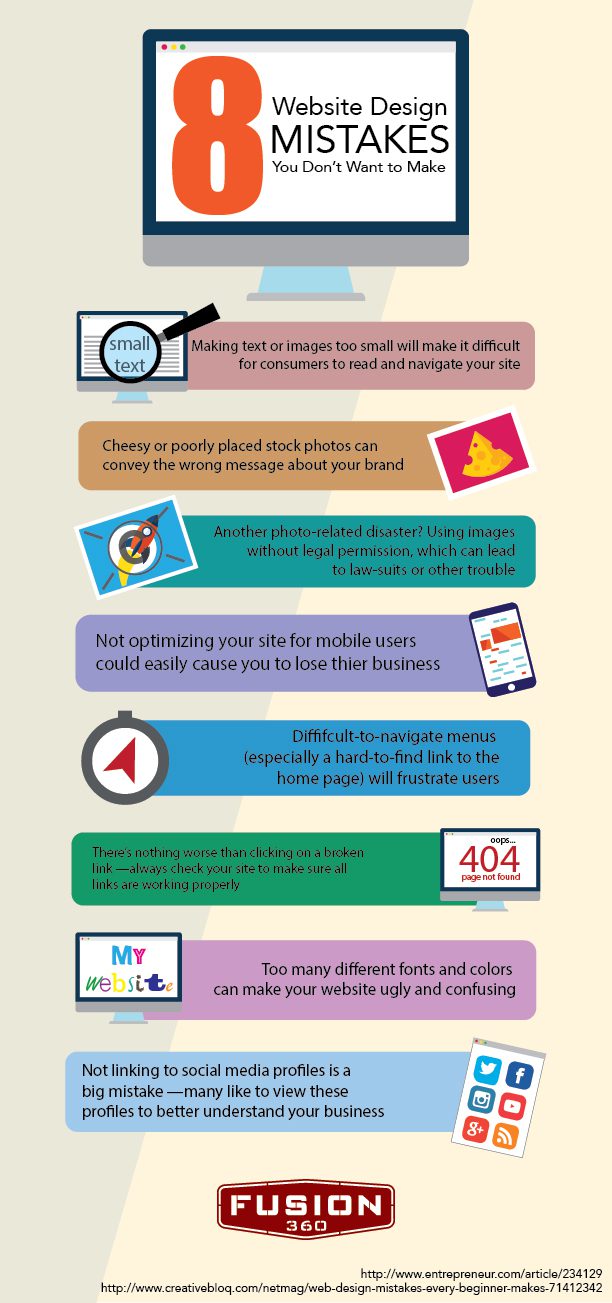
8 Web Design Flaws That Promise to Drive Away Visitors

By | web development | No Comments

Having your own little corner of the Internet in today’s day and age is all the rage. Whether it be for personal or entrepreneurial reasons, maintaining an eye-popping, up-to-date website is essential for not only attracting digital audiences, but for keeping them there once they’ve arrived.

That being said, if you’ve spent any amount of time either building a website or working as a web design specialist, you know that attracting audiences is a task easier said that done. If you’re intent on constructing a site worthy of widespread approval and traffic on the World Wide Web, there are a handful of mindless mistakes that should be avoided at all costs:

1) Poor Site Navigation

Few things are as frustrating for Web enthusiasts as poor site navigability. Customers shouldn’t ever feel confused or annoyed at what a website offers them. Far too often do web design specialists—even those with years of experience—provide visual elements which are difficult to interpret or scatter main navigation links all over a homepage. If such feelings arise because a user can’t quickly find what’s being searched, it’s unlikely that he or she will ever return.

2) Far Too Many Advertisements

This is more of an issue for bloggers and digital publication sites, but it’s still something that shouldn’t occur. While your site might rely on ad revenue to stay afloat or pull a profit, there’s no reason to bombard visitors with unending advertisements, many of which are difficult to exit out of. Never allow for ads to be the first thing that a user sees or for them to take up more room than your actual content does. Furthermore, and of extreme importance, pop-up ads can’t cover up the very information your guests are hoping to consume. With ads, the more discreet the better.

3) Poorly Organized Content Structure

More often than not, when conversion and retention rates suffer, poor content structure is somehow involved. In fact, it’s estimated that upwards of 50 percent of digital sales are lost when potential customers can’t easily find what they’re looking for online. Keep things simple, especially with your site’s content layout. If information can be presented on a single page, allow it to happen. Truthfully, this sort of problem presents a quick fix. Bold headings, introductions and highlighted keywords do more for enhancing content structure than just about anything else.

4) Content Inconsistency

Ever thought that you’d found the perfect site for what was needed only to realize that the site’s content was last updated four or five years ago? Though potentially accurate, inconsistent publishing is a huge deterrent for Internet users. If writer’s block has you at a loss for words, consider adding a blog to your personal web domain. Blogs are great for updating visitors with the latest information, news and interest-specific trends. Once the proper balance between interactivity, design and content production, has been discovered, the clicks come pouring in.

5) Forced Website Registration

These days, it seems like personal information is given out on a daily basis. Whether it be the creation of a new social profile or a rewards card at the grocery store, everyone wants access to your email address. It’s for that exact reason that people are hesitant to hand over personal information. If possible, allow visitors to register for site access without being hassled. When unavoidable, at least give users a taste of what they’re about to sign up for.

6) Overbearing Video & Audio

People love options. For experts of web design, this is a pivotal part of any design strategy. Speaking of the power to choose, reports KissMetrics.com, “Most people value their ability to choose what content to absorb. Having video or audio that loads automatically can potentially drive visitors away.” Audio and video are both excellent for keeping visitors on your site. With that in mind, however, when automatically loaded and implemented, dissatisfaction often ensues.

7) Visual Crowdedness

Visual discomfort doesn’t only come about when images and videos overload a page; unusual fonts, abrasive colors and obvious typos all play their respective roles in giving any visitor an unpleasant experience. Ideally, if the budget is there, a web design professional should be contacted for additional help. Seeing as how color palette, typeface and site tone can have a tremendous impact on customer conversion rates, it’s key that the best that the industry has to offer be consulted.

8) Dull Design

The entire purpose of a website is to feed valuable messages to earnest seekers of knowledge. If a site is dull, that end goal is hindered in its efficiency. At the end of the day, memorable moments are what bring people back to a site, time and time again. Yes, it’s true that minimalistic websites can be both beautiful and engaging, but when built improperly, they’re more an eyesore than anything else. Even worse, when tragically coupled with weak content, it’s literally impossible that a web domain succeed.

Whatever your specific design needs might be, heavy traffic is going to make the necessary time and effort required for building an incredible website worth the hassle. Needless to say, when the aforementioned design catastrophes are consciously bypassed, websites flourish.

Fusion 360 - 8 Apparent Web Design Flaws (Fusion 360 Web Development)

4 Thriving SEO Content Types Which Guarantee Driven Traffic

By | SEO | No Comments

There’s no need to talk with an SEO specialist about the importance of quality content and the strategic sharing of thereof. They already know all about it and, more than likely, have the software in place to help them figure out not only when a specific bit of information should be published, but where it should be made available for the digital masses to consume.

Oftentimes, the tricky part comes from determining exactly what kind of content should be produced. Think about it. From hysterical lists and memes to informative product reviews and e-books, the type of material that’s created can very much influence the level of rapport that’s built with Google or Bing. Needless to say, certain content types promise to perform better than others:

1) Blog Posts

Truthfully, it almost seems like the term “blogging” has become a buzzword in recent years. While you might have already grown tired of maintaining your own personal blog, it’s unlikely that the editorial practice go away any time soon. As traditional journalism rides off into the proverbial sunset, typical people—with little to no marketing or SEO need—have taken over and are now gaining the attention of millions of eager eyes each and every day.

Currently, blogs come in as the fifth most trusted source for digital information amongst active Web users. You read that correctly, right? Good, because this is where you—the SEO or content marketing guru—come into play. Business blogging isn’t like traditional blogging; it’s not an option. To more fully establish yourself as an industry leader with colleagues, potential clients and search engines, blogging is key.

In fact, studies have show that those who regularly blog are 13 times more likely to produce a positive ROI for either themselves or their respective clients. On average, companies that blog receive 97 percent more links to their sites than those who bypass the booming SEO practice. Don’t be on the outside looking in. The only thing that an active blog costs you is time; clearly, it’s well worth the investment.

2) Infographics

Though blog posts are splendid and can contain a wide variety of valuable data for site visitors to enjoy, generally speaking, they are lengthy and can’t be read in a handful of minutes. With audiences constantly being bombarded with digital distractions, you and your client need to provide content that’s both helpful and succinct.

It’s for this reason that, in the past few years, infographics—presenting complex data or information in a visual, easy-to-read way—have burst onto the Internet marketing scene and have become a secret weapon of sorts for SEO marketers. Even the science behind the eye-popping tool indicates to leaders of the SEO industry that infographics are here to stay.

For example, 50 percent of the human brain is involved in visual processing. Furthermore, research has found that colorful visuals increase piece readability by upwards of 80 percent. With that in mind, it’s no surprise that people remember over 80 percent of what they both see and do. Infographics play off of that innate tendency and, as a result, are liked and shared through social media up to three times more often than generic content.

While it’s preferred that a graphic designer within your professional network take on the responsibility of infographic production, the Internet does offer a number of do-it-yourself programs for those with smaller budgets.

3) Videos

As the desired attention spans of consumers become more and more difficult to attract and maintain, the importance of video skyrockets. Whatever your video centers on, it’s imperative that the communicated message be powerful in a memorable way. When crafted ingeniously, the SEO value of video is off the charts.

Does your client offer a groundbreaking new product or service? Consider a tutorial video to bring to light the brilliance of the money-making entity you represent. Seriously, 64 percent of people are more likely to invest in a product after viewing a video about it.

That being said, if things are being done at the ad agency or marketing firm level, implement a creative video or two to give on office tour or to show the lighter side of how things work down at the office. Internet users that voluntarily watch videos on a website—even if they’re of a commercial nature—spend 88 percent more time on said site.

Shockingly, using video as a means of SEO promotion, content marketing and social prowess is a relatively uncharted endeavor. Only 24 percent of brands use online videos to market themselves. Yes, it’s somewhat of a trying endeavor, but the payout is huge.

4) Podcasts

A few years back, podcasts were all the rage. Wrongfully, in today’s day and age, it seems that marketers and SEO experts have practically abandoned the homegrown media outlet altogether. Podcasts aren’t only for sportscasters and long-winded politicians, they’re for anyone with a message worth promoting.

In reality, podcasts are a great form of content. Seeing as how iTunes houses well over 250,000 podcasts, the medium is clearly still relevant. Not only do podcasts allow for the mobile ingestion of intelligence, but they’re easy to make, entirely free and allow producers to share a message with a broad audience. It’s that very level of accessibility that has over 46 million Americans over the age of 12 downloading them on a monthly basis.

As a helpful tip, when used for marketing purposes, it’s a good idea to combine one of the aforementioned content genres with your podcast to build intrigue and generate discussion. Additionally, publish the podcast’s transcript on your website to add even more SEO value to the effort.

Whatever level of SEO or digital marketing experience you have, knowledge is best obtained through experience. If you have yet to experiment with a certain content type, give it a whirl. When all is said and done, the product- or service-pushing magic you work on the World Wide Web—with an SEO twist, of course—will be heavily linked to the different kinds of content you manufacture and present for all to see.