The life of a professional web development specialist is certainly an interesting one. Normally filled with interminable deadlines, impossible expectations and a host of recurring technical problems, stress is often the end result. It’s because of this that, when possible, if anxiety can be mitigated and the overall production process quickened, developers are all ears.
More often than not, this is accomplished through a myriad of website design tools. Seeing as how we’ve been building incredible sites for our clients for a number of years, we’ve taken the necessary time and effort to jot down a few of our favorites.
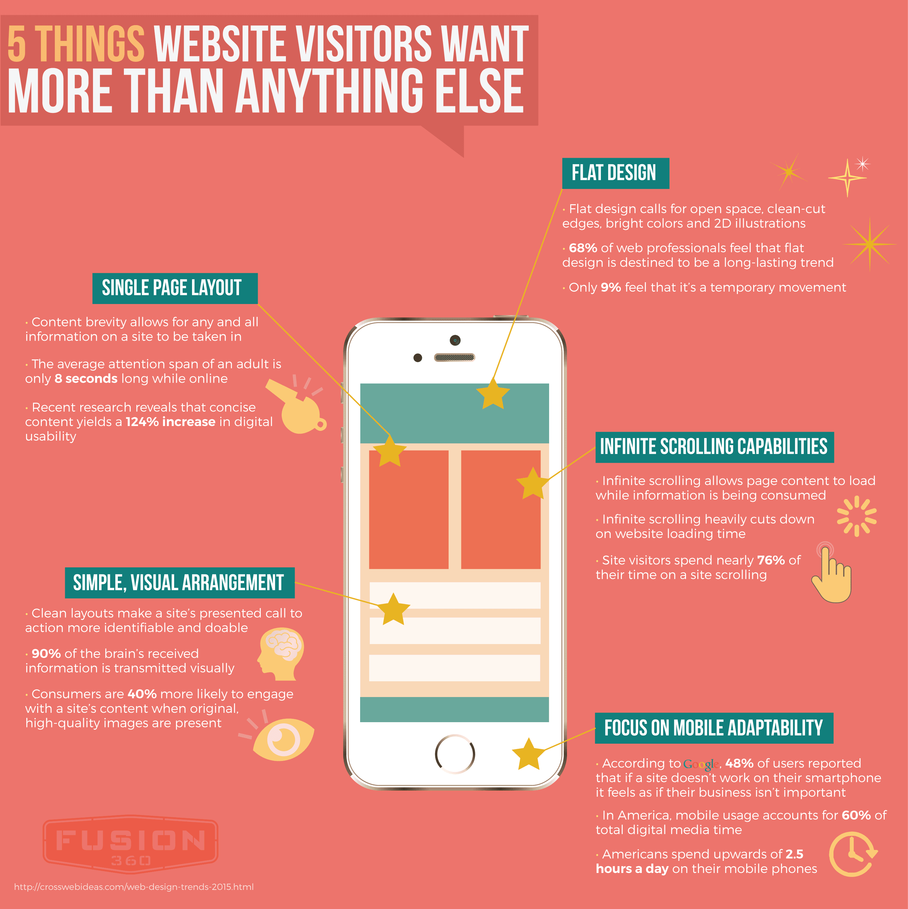
Professionally, just about everything is sales. Regardless of your field of interest or money-making niche, if success is to come about, you’ve got to be able to understand what consumers want and help them understand how your product or service helps them accomplish such a desire. Likewise, when creating a reputable website and its design, it’s important to consider what target audiences want more than just about anything else.
While it’s true that each industry carries with it a specific set of differentiating factors, generally speaking, when digital interfaces are involved, there are a handful of factors that any and all visitors will hope to find. The following infographic presents five things that any successful website, especially in today’s digital age of communication, will have present. How well does your current site stack up?
Making a website look cool may seem like the perfect way to capture the attention of web browsers around the world. Maybe it is—but it is not how you get those browsers to stick around. Flashy pages may draw people in, but it is the content that will keep them engaged.
The number one way to keep viewers engaged is to keep them on the site longer. How do you go about convincing viewers that your site is worth the stay? Below are a few simple ways to take your site from trashy to trusted.
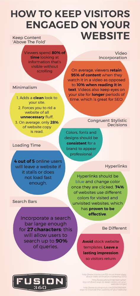
Keep Content ‘Above the Fold’
While many may think that keeping content “above the fold” is an age old practice meant for print media, it is still relevant online. “Above the fold” generally meant that the most important information was placed on a newspaper above the line where the paper naturally folds. That way people would see the most important information first and get drawn in to read more.
However, with web development it is still imperative to keep the information that is the most important above a certain point. Rather than a fold line, though, it will be a scroll line. Before the viewer has to scroll down the page at all, the content should be interesting and relevant enough to reel them in. That way, their glance over will cause them to stop and want to stay for more.
80 percent of viewers spend their time on websites without any scrolling. What does that tell you about technology users? They waste no time. Providing the most important information first during development will make viewers feel like your website is worth their time and will continue reading.
Incorporate Videos
With the rise of millennials came the rise of video in content marketing and web development. Technology has made everything faster, encouraging real time updates and anything that caters to short attention spans. While the number of people who read text Online has gone down, the number of people who watch videos has gone up.
Viewers retain 95 percent of content when they watch videos but only 10 percent when they read text. If you are worried about keeping eyes on your website longer, videos are the solution. They require eyes to stay on the site for a longer period of time, giving you more opportunity to peak interest and turn viewers into consumers.
After all, YouTube is the number two search engine in the world. That means that videos have a way of getting to people. There are a few reasons for this. In Susan Weinschenk’s research about customer psychology, she outlines four reasons why video works:
The Fusiform Facial area makes viewers pay attention to faces because our brains are hardwired to believe human faces more than words on a page.
The sound of a voice makes content more meaningful and adds needed color to text.
Emotions and body language are actually contagious. Watching someone else feel a certain way about a product or experience can change the viewer’s own opinion.
Movement is eye catching. It grabs viewers’ attention and holds it there long enough for intended messages to get across.
Using video is becoming common place in the marketing world. Involving it into your web development is imperative. Any site without video is voluntarily lagging a few steps behind everyone else.
Start With Minimalism
Some may think that people like choices. Well, that’s not necessarily true. Why do you think companies like In-N-Out with a 4 item menu or Apple with such uniform products have success? It’s because people like to be told what they want while still feeling that they have the freedom to choose. No one wants to be overwhelmed.
The trick is to be simple. Use minimalism in your web development that is pleasing to the eye and easy to read. On average, only 28 percent of website copy is read. Scanning has become the norm.
Using minimalistic design also forces every website to only include the important items. This will make it easier for certain messages to translate over to viewers. They will know exactly what a company is trying to say because the message won’t be hidden beneath unnecessary information.
Use Congruent Stylistic Techniques
Just as viewers don’t want to be overwhelmed with information, they also don’t want to be overwhelmed with too many different colors or designs. Choose a set color scheme for the website and use it consistently throughout web development.
Using the Adobe Kulur tool can easily solve this problem as it helps designers choose a scheme and lays out all of the colors that can play into that scheme.
Improve Loading Time
Going back to the short attention span phenomenon that permeates the modern age, loading time is an important factor. Viewers want to see the page almost instantaneously, and if something takes too long to load, they will have no problem leaving.
In fact, four out of five online users will leave a website if it takes too long to load. That’s 80 percent of viewers. Losing 80 percent of viewers is a big price to pay for such a small problem.
According to surveys by Akamai and Gomez.com about half of users expect to have the page loaded in two seconds. If it takes past three, they usually bail. Don’t worry, Google developed a tool called Page Speed Online so any web developer can measure the speed of their page and improve development.
Separate Hyperlinks
Hyperlinks may not seem like a big deal as long as they are included, right? Well, apparently those sites that change the color of hyperlinks from when they haven’t been clicked on to when they have been clicked on have proved to be more effective.
Making sure hyperlinks work is vital in web development, but separating the color based on click status is something that viewers like to see. It is helpful to the user which will ultimately benefit the web developer.
Always Include Search Bars
Search bars are a must-have for any web development. They may almost be more important than hyperlinks because it allows a user to easily navigate through a website. If a viewer comes to a site looking for something specific and can’t find it, that could cause them to give up altogether.
Search bars should be large enough to incorporate 27 characters which allows users to search up to 90 percent of their questions. This way potential consumers will have a greater chance of actually sticking around because they know that they can find what they need.
Make it Different
Although it may not be the most important technique to keep viewers engaged, it will initially reign them in. Using a unique design on web development will help viewers to feel connected to a website and find personality within a brand.
Avoiding stock images and instead use an original design in web development that will leave a lasting impression. This will ensure that users will not only be drawn to the website but will want to return. Make sure this is the cherry on top, however. Just because a website is flashy, doesn’t mean it will convince viewers to stay. Combine style and strategy for a website design that will last.
From all parts of the country, be it in Utah or New York, everyone knows that great images are an essential part of any solid web development strategy. Unfortunately, most website design specialists aren’t freelance photographers in their spare time and have little to no access to a robust portfolio of remarkable photos.
Options are as follows: you could take the photos yourself, purchase them from a talented photographer or simply download them from a stock image site. Generally speaking, the later is preferred. That being said, when shopping around on the Internet for a digital archive of complementary images, some sites are simply better than others.
1) Unsplash
For many web development experts, Unsplash has proven to be an incredible resource. Visit its home page and the first thing you’ll be met with is the website’s mantra: “Free (do whatever you want) hi-resolution photos.” Unsplash specializes in blog-style photos of landscapes which almost always come with astounding lighting and extraordinary effects. Not only are 10 new photos submitted every 10 days, but each image contains a link to the credited photographer, just in case you’d like to learn more about the genius behind your newly acquired visual aid.
2) IM Free
Truthfully, IM Free is relatively new to the stock image scene. Separating the aforementioned site from its competitors is the fact that it contains helpful templates, buttons and icons—in addition to stock photos, of course—to more fully further the web development industry. If digital depictions are all you’re after, however, you’ll be pleased to learn that this library is known for well-organized photos that are conveniently grouped by category.
3) The Amazing Pattern Library
Technically, this site’s not actually for stock photos. In reality, The Amazing Pattern Library differs heavily from the other domains on our list in that, you guessed it, it’s main focus is to provide web development enthusiasts with a wide variety of patterns, many of which have impressively been created by some of the world’s most talented designers. Though spacious and detail-oriented, this collection’s high-quality pictures quickly download with just one simple click of the mouse.
4) Foodie’s Feed
Exclusively, Foodie’s Feed features edible items in its image arsenal. Believe it or not, visually showcasing delicious foods in a presentable manner is substantially harder than you might’ve originally thought. In fact, says DesignModo.com of the culinary compilation, “From beautiful deserts to simple garden veggies, Foodie’s Feed has images of almost any edible item you can imagine.” The website uploads a minimum of five new images—many of which come from a single take—each and every week. Foodie’s Feed is supported by user donations through PayPal.
5) New Old Stock
Though a bit oxymoronic in name, New Old Stock does a splendid job of combining the perks of modern-day file sharing with the splendor of vintage photography. If any one of your current web development tasks requires black and white images from decades past, consider New Old Stock your ideal supportive reserve. On this site, the vast majority of images are readily available on the public domain for widespread use due to their age.
6) Free Refe Real Life Photos
Believe it or not, a person can actually accomplish a great deal of artistic good with nothing more than a cell phone camera. Free Refe Real Life Photos is virtual proof of such an assertion. All of this website’s provided images were taken with nothing more than a mobile device. Said images primarily cover simple objects and landscapes which make them useful in divers amounts of web development ventures. Unfortunately, many presented images might be too small for print.
Whatever your web development undertaking may be, stock images are bound to play a role. Armed with the necessary visual outlets to make any project pop, you’re bound to see a sharp increase in both pleased clients and site visitors.
Putting together a landing page worthy of the most stubborn of Internet enthusiasts can be a difficult task. Not all of us are website design specialists. Furthermore, innumerable are the factors that, for starters, bring a person from one remote catacomb of the World Wide Web to your brand’s website.
Getting them to browse and interact for a healthy amount of time all while also building a bit of investor intrigue? Well, that’s an entirely new digital design beast worthy of a sound investigation. That being said, there are a handful of tried and proven methods to make such a miraculous occurrence happen on an astoundingly regular basis.
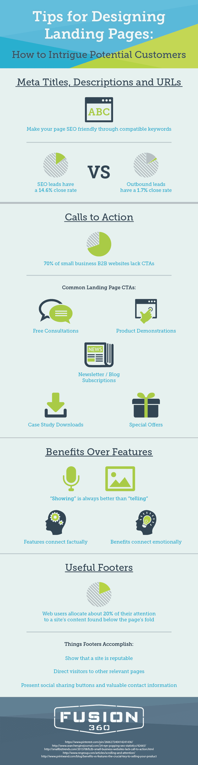
1) Meta Titles Descriptions and URLs
For starters, look to meta titles and descriptions to make a difference. When used properly, any digitally-driven traffic which makes its way to your landing page will, more than likely, be of a higher quality.
Additionally, make your landing page SEO-friendly through relevant keywords. SEO leads have a 14.6% close rate, while outbound leads—direct mail or paper advertising, for example—have a 1.7% close rate.
2) Calls to Action
In most cases, when people hear the term “call to action” (CTA) being tossed about, they think of intrusive telemarketers or pushy door-to-door salesman who make a living by “assuming the sale” and then “closing” as soon and as often as possible. However, unbeknownst to many both inside and outside of the website design community, a CTA is completely ethical and, most assuredly, will separate your landing page from those of your competitors.
Whether it be a “call now,” “find out more” or a “visit a store today,” CTAs are not being used with nearly enough regularity. In fact, 70% of small business B2B websites lack any sort of CTA for consumers. The most common of landing page CTAs involve newsletter/blog subscriptions, product demonstrations, free consultations, case study downloads or special offers.
3) Benefits Over Features
People don’t like the feeling of being sold. Fast-talking salesman who focus on the “newest upgrade,” “latest add-on” or “groundbreaking update” appear to be trying to meet regulatory sales quotas without having made any sort of connection with their audience. Normally, it shows in their sales success or lack thereof.
With website design, generally speaking, when pushing products or services, it’s better to “show” rather than simply “tell.” Since features work on a factual level rather than an emotional one, their value is often viewed as confusing, less than applicable and, unfortunately, sales-centered. Testimonials or product demonstrations by way of shareable Internet video are excellent tools for website design experts looking to make some noise.
4) Useful Footers
Web users allocate about 20% of their attention to a site’s content found below the page’s fold. Though seemingly insignificant, they’re almost always looking for additional information. Apart from showing that your site represents a reputable business, footers allow your landing page to direct potential clients to other pages which may further interest them.
Even more important, footers often contain social sharing buttons and contact information for those serious about taking the next step to get to know you and your brand. Needless to say, when building a company from the ground up in this, the digital age of communication, an impeccable landing page is of the utmost importance.
The Internet is a massive place. So massive, in fact, that—according to research conducted by Netcraft in March of 2012—there are over 644 million active websites. Considering how large the Internet is, however, that number is relatively small. Case in point, there’s plenty of territory left to be claimed out on the endless frontier that is the World Wide Web.
Regardless of whether you consider yourself an expert of website design or not, in order to build and maintain virtual audiences, there are a handful of website design errors which must be avoided at all costs. Simply put, digital audiences consider them completely and utterly inexcusable.
1) An Absent Search Box
In theory, any given website should be an archive of valuable information. Whether you’re dealing with a Fortune 500 website or simple blog, a visible search box couldn’t be more important. More often than not, visitors already have a general idea of what it is that they’re looking before your page has even loaded.
With a search box properly in place, site frustration is greatly minimized as users are quickly directed to what it was that they were originally hoping to find. In order to make certain that site searches take place in a neat, effective manner, consider using Google Custom Search or similar programs.
2) Subpar Navigation
Poor website navigation is one of the biggest turnoffs for users. Like any well-designed community, navigability shouldn’t be much of an issue. Though there aren’t many website design norms for seamless navigation within a site, it’s key that transfers from page to page occur in an intuitive and consistent manner.
Says Hongkiat.com in the ways of navigational advise, “If text is used as navigation, it should be concise. Visual metaphors should not be re-invented. If hyperlinks are used, then they should stand out from the body of the text. Dead links should have no place on any web page whatsoever.” As a canopying rule of thumb, structure navigation so that it works closely with the widespread theme of the website. By so doing, prevailing confusion is avoided in its entirety.
3) Cumbersome Registration Forms
This is by far one of the most annoying of unforgivable website design mistakes. Before a site’s design is completed, it can be helpful to take a figurative step back to see how much information you’re requiring of your guests. How many fields are present? How many mandatory fields are required? Could what’s being solicited be interpreted as intrusive or overbearing in any way?
Furthermore, it’s important to keep automated validation filters in check. If users are unable to comply with your registration standards after a few tries, they’ll most likely opt for one of your competitors instead. Registration for a site should require little to no information and encourage the consumption of information, not the giving of it. Needless to say, as proper website design tactics are put into practice, real results can be expected.