Advertising Tricks to Make Crowdfunding Campaigns Successful

By | advertising | No Comments

Asking people for money is not just uncomfortable—it doesn’t always go well either. People usually don’t donate just for the sake of giving away money; they need a purpose. Although many crowdfunding campaigns have a good purpose, it is not always clear to the public.

Using advertising can help spread the purpose behind crowdfunding campaigns out to the general public. This way they won’t just see a company asking for money, they will see an opportunity to contribute to a great cause.

There are specific advertising techniques that showcase crowdfunding at its best. It’s finding those techniques that can often be a struggle for an agency. Below are some tips for specific types of advertising to use in your next crowdfunding campaign.

Start With Social Media Advertising

This is a free and easy way to kick start your campaign. However, make sure to not use every social media channel out there. Hone in on a select few based on the audience at hand and dominate those outlets.

Social media also provides a chance for an agency to not only advertise, but interact with the public. People are much more likely to support a cause when they feel part of it. Asking questions, requesting opinions and seeking out stories can turn originally uninterested people into loyal donators.

Make sure to customize the promotion so that it reflects a common purpose across each social media outlet. This is a personalized way to bring the purpose of a campaign to an audience’s attention.

Target a Specific Public

While it may seem more logical to advertise a campaign to the entire world since that would provide more donating hands, it is not the best way to get donations. Choosing one or a few specific key publics to reach out to is a much more successful technique for any agency.

When choosing the publics, make sure that they are either already a supporter of your brand or have a reason to be interested in the campaign’s purpose. Who would be most likely to donate? Who would care about the cause at hand?

Think about these things and choose a few publics to target. You may be surprised that this type of advertising receives more response than general advertising.

Create a Personal Connection

Once you have found the best audience for your advertising, try and build a personal connection with them. This means using those social media channels for frequent communication. It also means giving the company a face. Introduce team members who truly believe in the crowdfunding cause.

Integrate both personality and humor into a campaign for increased success. Using the team as part of a campaign or funny advertising stunt will pull in more interested donators. People feel connected to people. That is a large motivator for donations.

Wait a While to Ask For Money

With that connection in mind, don’t ask for money right away. This will make people second guess your intentions and feel pressured. Simply create a connection with important publics and let them know about the crowdfunding cause.

From there, donations will naturally occur as people begin to feel a sense of duty to an agency and want to be a part of their efforts. Make sure the public can see how the money from the campaign will be used upfront. This way they know that although they may not get their money back, it is being  used for something they support.

Use Video In Advertising

Another technique that will ensure those donations keep coming is to use video. This goes back to the connection principle because people are more stimulated by video rather than text. Use this to your advantage by creating a connection with a video that plainly portrays the purpose behind the campaign.

This not only builds trust between the public and an agency, but it is an advertising technique that is known for catching the eye of the public and keeping it there.

Start Big

Any agency that receives money during the first three days of a campaign is more likely to reach their target goal than those that don’t. This means that a big start is a big part of any crowdfunding campaign. Don’t shyly put the word out there and hope that maybe someone cares. Plan out advertising techniques ahead of time and launch them loudly with the start of a new campaign.

Using all of these advertising techniques can be the thing that makes crowdfunding go from an impossible attempt to an easy way to raise money for an agency. Remember to keep a connection with a select audience and build trust from there. Donations will follow.
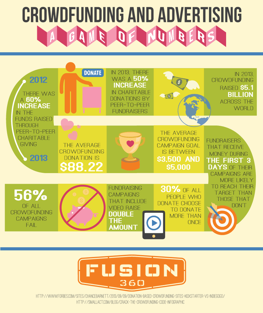

Fusion 360 - Crowdfunding and Advertising - a Game of Numbers (Fusion 360 Agency)

Building Blocks of SEO: Construct Your Website With Tools for Optimization

By | SEO | No Comments

Search engine optimization (SEO) can seem like a foreign language, especially to those who are first diving into building a website. The trick is to get down the basics of SEO construction. Once all the right foundation blocks are in place, the rest can quickly be built from there.

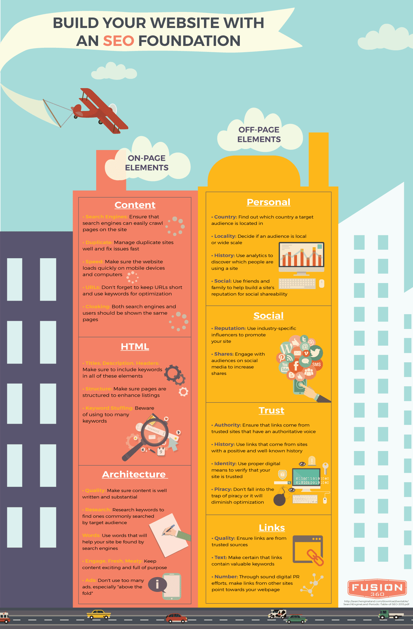
There are two separate types of SEO to understand before attempting to optimize a website.  The first are on-page factors. These will be the content or keywords that are built into the website and are under the direct control of the publisher.

Once that is established, the off-page factors come next. Those are the elements that are influenced by other readers, visitors and publishers from around the world. Smaller building blocks within these two structures will ultimately build a site that is SEO ready.

On-Page: Content

The first place where SEO can be built in for maximum optimization is the content. This may seem obvious, but there are certain elements that must be included for content to be successful. The pages must all be full of quality content—things that will interest the right audience.

Once you’re sure that the content has purpose and intrigue, use research to find keywords that will most likely be searched by your target audience. Google AdWords is a great tool that can make this process quick and easy.

Make sure the researched keywords match up with the words you hope  your website will be searched for. They must match up with the purpose of the website. If not, the keywords will be obvious and out of place.

From there, tweak content to make it engaging, in line with trending topics and full of actual substance. No one wants to read something they already know about. Don’t forget to also minimize ads, especially “above the fold” where most viewers hang out on the webpage.

On-Page: HTML

Once content is created, HTML comes next to display it all on the website. However, don’t just develop HTML without considering how SEO can play a part. Use geo-qualifiers with your HTML to draw in locals, or use other words that will seek out larger target audiences. Make sure to include these types of keywords in the title, description and headers on your webpage. That being said, beware of keyword stuffing. When keywords are used in abundance, it’s likely that a digital penalty be issued. As a result, PageRank suffers.

Finally, make sure the pages are structured in a way with data that will enhance listings. Incorporate all of these techniques into your HTML, and you will find that the site’s ranking significantly goes up.

On-Page: Architecture

Everything that is built needs some sort of architecture. It is the mechanics that make a house—or in this instance, a website—function.  Although the audience can’t see it, they will notice if the architecture is lagging.

Incorporate SEO into this architecture to make sure viewers are unaware of any “bugs.” The first way to do this is by ensuring that search engines can easily crawl pages on your site. Most people, regardless of where they come from, use search engines for andy and all web browsing.

Duplicate content can also be a common issue. How does the site manage this duplicate content? Make sure it is optimized for a quick fix. It is also important to make sure the site loads quickly—on mobile devices and computers. Viewers will not stick around past three seconds, so this aspect of SEO is vital.

Steer clear of “cloaking” pages to show up differently to search engines and humans. People want what they think they are going to get. Finally, make sure URLs are short and include keywords. This will take architecture to the next level.

Off-Page: Links

On the flip side, off-page factors are still important, although they may not be directly influenced by the publisher. Start by making sure links are from trusted sources. This will persuade more viewers to trust enough to give your link a click. Don’t forget to include in the text of links important SEO keywords for optimization. Also, it is a good idea to ensure links on other websites point back to yours.

Off-Page: Trust

Dive down deeper into the trust aspect of  your links. People want to know they can trust what they read. Only use links that have authority or a good history already established. That way being associated with that source will enhance your site’s own authority.

Take it a step farther and use sources that can stamp your site with a trusted identity. Meanwhile, keep in mind that being flagged for piracy will never reflect well for your SEO optimization. Keep it honest and trusted with legitimate links.

Off-Page: Social

Never forget to incorporate social media into your SEO strategy. This is extremely important nowadays with millennials who spend most of their days on such sites. Use social media influencers within your target audience’s social circle to promote your site. It is also a good idea to engage with your audience on social media to influence more shares and spread the word faster about your site.

Off-Page: Personal

After a website is built with the aforementioned foundational blocks, circle back with analytics. Find out who is visiting your site and learn more about your target audience to increase their viewership. Consider things like where in audience is coming from, if users have visited the site before and if you are tapping into their influencers for help. SEO should never be left out of website development.

Needless to say, using these building blocks can take an unsuccessful attempt at constructing a website and transform it into an easy way to spread the word about your product or service. Don’t take any chances—incorporate SEO.

Fusion 360 - Build Your Website With an SEO Foundation (Fusion 360 SEO)

Timing is Everything: How to Optimize Social Media to Your Advantage

By | Uncategorized | No Comments

Social media has quickly become the be-all and end-all of marketing outlets. Depending on the audience, other means of communication are still important. However, almost every audience is involved with social media. It’s therefore a sure fire way to spread the word.

The problem is figuring out how to post in a way that will grab attention among the millions of others out there seeking the same eyes. The trick is: timing. If something is posted at a time of day when your audience will not be online, then it goes unseen.

Not only are there certain times of the day when posts are more likely to be read, but there are also times of the day when posts are more likely to be shared. Figuring out what those times are can take companies from desperately posting to dominating feeds fast.

Below are timing strategies that will ensure marketing success for every main social media outlet.

The Social Media King: Facebook

The best times of the week to post marketing material on Facebook are Thursday and Friday. At the beginning of the week most people are motivated to get work done. By the time things wind down with the weekend pending, minds start to wander.

However, by the time the weekend actually hits, no one wants to sit at a computer any longer. 86 percent of Facebook posts happen during the work week. Although engagement rates are better on Thursday and Friday, and the average falls by 3.5 percent Monday through Wednesday, a work week post will still trump a weekend post. 

Not only are eyes important, but moods hold weight as well. Finding a time when your audience is happiest will make it more likely that they share your posts. The happiness scale goes up 10 percent on Friday.

Now what about time of day? The best time to post on Facebook is in the early afternoon. The most shares will occur at 1pm while the most clicks will happen at 3pm. Depending on the type of action companies want out of a post, they should choose one of these time slots.

Don’t forget, however, to always remember who your audience is. These suggestions apply to the general public, but it may vary depending on who you are trying to reach.

Real Time is Optimal Time: Twitter

Things are a bit different for Twitter posts. The best time to post marketing material on Twitter just so happens to be the weekend: Saturday and Sunday.

Again though, this depends on the audience at hand. When attempting to communicate with another business, weekdays are 14 percent more likely to have success than weekends. It’s the customer communication that should take place on the weekends.

Since Twitter is primarily sought after on handheld devices, it is easier to use while out and about. People are more likely to engage with companies on Twitter if they are relaxed and have time for fun.

As for the time of day to post, 5pm receives the most retweets while 12pm and 6pm have the highest click through rate. It is smart to factor in a commute as well. If your audience has a daily train ride with an hour of free time, remember that they are 181 percent more likely to be on Twitter during that time.

The Professional Network: LinkedIn

LinkedIn is primarily a business social network. It just makes sense that people are more likely to engage with companies on this outlet during business hours. Therefore, the best time to post on LinkedIn is Tuesday through Thursday during work hours.

When asking the question: which work hours are the best—simply think logically. Most people check their personal outlets when they first arrive at work and right before they leave. It is reasonable then that 7am-8am and 5pm-6pm are the absolute best times to post.

However, if clicks and shares are what you want, Tuesdays from 10am-11am prove best. While this type of audience may be less of a direct marketing campaign for companies, using LinkedIn is a great way to reach influencers. These contacts can be the ones to carry your marketing campaign for you.

For the Recreational Audience: Pinterest

Pinterest is perhaps the least  professional outlet of them all. However, it does serve its purpose and it serves it well. Using this outlet with an audience that consists of women who enjoy cooking, shopping or crafts is a smart move.

If shoppers are what companies want, then pin on Fridays at 3pm. That is when the fashion retail lovers are buzzing the most. However, in general, the best time to post on Pinterest is on Saturdays between 8pm-11pm and 2am-4am.

Pinterest is a late-night hobby that most people jump on at the end of a long day. Weekends prove to be the best for companies to post marketing material because no one has to get up early in the morning. Therefore, any late-night pins are also guilt-free. 

The Artsy Types: Instagram

Another outlet on the fluffier side of things is Instagram. This outlet is becoming more and more popular in today’s hipster-fashioned world, especially among teenagers. If the artsy types are the audience at hand then Instagram is the key.

Since Instagram consists of short posts with pictures as the main attraction, posting stays consistent pretty much all week. Slight spikes take place on Mondays and small dips occur Sundays.

For Instagram, work hours are not its friend. 22.5 people per 1,000 Instagram followers interacted with posts during work hours while 33.4 interacted with companies during off work hours. Instagram usually pops up when someone wants to share an experience. Let’s be honest, what crazy happenings go on in the workplace? Post marketing material on off hours to receive the most engagement.

Don’t Take Timing Lightly

Social media marketing may seem easy because it doesn’t require much effort. What it does require, however, is strategy. Timing should always be incorporated in that marketing strategy for companies to see success.

Mobile Sites: Features Every Web Developer Must Include

By | web development | No Comments

Whether it’s a site made specifically for cell phones or not, every website now needs to be adaptable for mobile devices. However, handhelds read a lot differently than large computer screens. That means that web development adjustments must be made.

Keeping that in mind, what are these necessary adjustments? Which changes are most important and which ones can be overlooked? Below are nine mobile-friendly features that must be included in order to keep handheld viewers coming back:

Buttons That ‘Click To Call’

Millennials love to have everything right at their fingertips. Mobile devices are a big part of what makes that possible. Technology has also shortened the attention span of frequent users. That means if something is too difficult to access, they have no problem giving up and finding something that can satisfy their needs quicker.

Most people nowadays also don’t travel to check out a store or product. They will call first, make sure they can find what they’re looking for at the location and then make the trip out there. This makes “click to call” or “click to SMS” buttons imperative.

Don’t forget during web development that the easier a navigation process is, the better. More people will inquire after your product or service if “click to call” buttons are included.

Lay Out Directions

Once a viewer does decide they want to take the next step and visit your store location, it should continue to be an easy process. Include a mobile map in web development that can easily guide potential customers to you without any hassle.

This can be done by including a Google Maps widget. Also be sure to include step by step directions along with the map itself so that customers won’t give up and turn the car around.

Keep Contact Forms Simple

Although most will simply call a company to make an inquiry, some people prefer email or contact forms. Make contact forms as short and simple as possible so that again, contacting you is not a hassle. Difficulty is one of the top things that will turn away interested but flighty customers.

Web development should revolve around simplicity. Especially in regards to how a customer can contact personnel. The easier and faster it is for them to accomplish their goal, the more likely they will be to return.

Create Collapsible Content

Content should also follow the principle of simplicity. It is easy to get carried away with too much information during web development. Although it all may be important, choose the most relevant information to feature first.

Then, use collapsible content so that users don’t have to scroll down the page at all. This way one touch of a minimize button can bring up new content without cluttering the screen.

Tricks To Easy Navigation

Once a customer decides they want to explore past the home screen of a website, navigation should be effortless. One way to do this is by including a “back” button at the bottom of each page. Also, make links or other pages bold and pop out  so that there is no doubting buttons are buttons.

Don’t just focus on the homepage aspect of web development. Make sure that every single page is easy to explore, and that all signs point to home. It shouldn’t be difficult for customers to get back to the main page.

Include Video Content

Another part of the millennial generation that is taking over the technology world is video. Millennials (and most people for that matter) are stimulated by sight. They connect better with images flashing on a screen rather than words.

Videos not only grab attention, but they are more successful at holding that attention too. 41 percent of users prefer video over text. Even if it is just an introduction to your company or product, include at least one video in web development.

Make Buttons LARGE

As discussed before, navigation should be easy. That means you should make buttons bolder and bigger. If it is an important button that will spread the word about your site, make it bigger than the others. It will more likely catch the eyes of browsers that way.

Social media links should especially should not be hidden. Use the logo for each social media outlet and make it look like a button that when customers click on, it will take them right to the outlet. Specifically, buttons should be designed during web development to be between 45 and 57 pixels.

Don’t Forget the Link

Although you may already be planning to include “back” or “home” buttons in your web development, don’t forget to include the entire link. This way if someone wants to copy and paste or open your website in a different browser, it is uncomplicated.

After including all of these important features, remember that usability is key. Simply ask yourself if anyone could get frustrated while using your site on a mobile device or otherwise. If the answer is yes, then it’s time to rethink your web development.

Fusion 360 - 9 Necessary Features for Mobile Sites (Fusion 360 Web Development)

Marketing Your Startup From the Ground Up

By | digital marketing | No Comments

Building a company is many things, but one thing that it will always be is a challenge. There are numbers to crunch, people to hire and products to build. With all of that to consider, sometimes Entrepreneurs miss the most important part: marketing.

Learning how to market your company can be the very thing that makes it successful. Although the rest is important, without marketing there will be no customers; without any customers, there would be no sales; and without sales, there will eventually be no more business. That’s why learning the tricks of startup marketing is not just important—it is vital.

Keep Company Goals in Mind

Before anything is solidified within new companies, they first must set goals. Both short-term and long-term goals will set the standards for future actions within those companies. Therefore, these same visions must be kept in mind when entering the marketing phase. Understanding the purpose of the startup will direct a company towards the right key publics, deciding which consumers are the right consumers to target. Zeroing in on a few specific types of people is important. If a company attempts to market to everyone they will usually find themselves left with no one, especially with the limited resources of a startup.

Figure out which types of consumers would be most likely to fulfill the goals of the company. What kind of person would buy your product or use your service? Once you figure out who your audience is, learn everything there is to know about them. This will then guide the rest of the marketing process because different consumers obtain their information in different ways.

Piggyback On Partnerships

When it comes to a starting a business, the best way to learn is from those who have already been through the same exact thing. Find established companies with whom you can partner with. Find out how you can help their company and they will most likely be happy to help yours in return. These companies can not only act as a mentor but can feature your product on their blog or website that already has solid followers.

Make sure to find a company, however, who fits in with your personal brand identity. It is better to learn from someone in the same industry. Also, it is important to partner with a company who is trying to reach the same audience as you. This way it will make it easier to reach out to your key consumers. Associating with a well-known and well-loved company can be the “in” that establishes your startup as noteworthy. If the big-wigs thinks it’s cool, then it must be.

Developing Content and Establishing a Brand

Perhaps the most important part of marketing a startup is creating content that will stick. Consumers want content that relates to their lives and is interesting. Establishing branded content will help any startup connect with their target audience. The brand must be something that the audience feels they can connect to and be a part of. Gone are the days when selling a product was about convincing people; millennials now want brands that allow them to join in and become involved.

The best way to do this is to avoid promotional content. Companies need to discuss topics within the industry or present interesting findings to consumers who care. Provide legitimate information that gives the chance for consumers to join in on the discussion with companies.

Don’t Forget Social Media

In order to give consumers that chance to converse, companies must have a presence on social media. This may seem like a no-brainer since it is a free and easy way to get in touch with target audiences. However, it may be so easy that some companies put their focus elsewhere. Don’t forget that social media is one of the main communication channels of the modern age. It is now how people receive information every day. Not only that, but it provides an easy route to reach out to specific influential people in the industry and spark discussions.

Strive For a Viral Status and Incentivize Sharing

Take that social media to the next level by striving to make content go viral. This is a step that will come later for startups as it may not be easy to even gain the eyes of the target audience at first. Once a company becomes a little more established, however, think of ways to make content spiral and spread. This can be done through contests, urging people to tag or share with friends, holding events or extending questions in need of response. Keep the “sharing” goal in mind while developing content. Think about whether your consumers would not only be interested in the content, but would also be motivated to share it with their friends and family. That will eventually extend your brand to multiple publics, reaching the eyes of millions.

Keeping marketing in mind throughout the adventure that always comes with building a company from scratch is vital. There may be a lot to do, but don’t forget that marketing will eventually be what brings your company success.

Keep Viewers Engaged: The Must-Haves of Web Development

By | web development | No Comments

Making a website look cool may seem like the perfect way to capture the attention of web browsers around the world. Maybe it is—but it is not how you get those browsers to stick around. Flashy pages may draw people in, but it is the content that will keep them engaged.

The number one way to keep viewers engaged is to keep them on the site longer. How do you go about convincing viewers that your site is worth the stay? Below are a few simple ways to take your site from trashy to trusted.

Keep Content ‘Above the Fold’

While many may think that keeping content “above the fold” is an age old practice meant for print media, it is still relevant online. “Above the fold” generally meant that the most important information was placed on a newspaper above the line where the paper naturally folds. That way people would see the most important information first and get drawn in to read more.

However, with web development it is still imperative to keep the information that is the most important above a certain point. Rather than a fold line, though, it will be a scroll line. Before the viewer has to scroll down the page at all, the content should be interesting and relevant enough to reel them in. That way, their glance over will cause them to stop and want to stay for more.

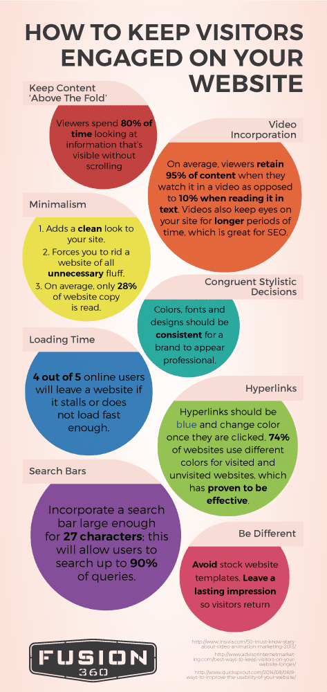
80 percent of viewers spend their time on websites without any scrolling. What does that tell you about technology users? They waste no time. Providing the most important information first during development will make viewers feel like your website is worth their time and will continue reading.

Incorporate Videos

With the rise of millennials came the rise of video in content marketing and web development. Technology has made everything faster, encouraging real time updates and anything that caters to short attention spans. While the number of people who read text Online has gone down, the number of people who watch videos has gone up.

Viewers retain 95 percent of content when they watch videos but only 10 percent when they read text. If you are worried about keeping eyes on your website longer, videos are the solution. They require eyes to stay on the site for a longer period of time, giving you more opportunity to peak interest and turn viewers into consumers.

After all, YouTube is the number two search engine in the world. That means that videos have a way of getting to people. There are a few reasons for this. In Susan Weinschenk’s research about customer psychology, she outlines four reasons why video works:

  1. The Fusiform Facial area makes viewers pay attention to faces because our brains are hardwired to believe human faces more than words on a page.
  2. The sound of a voice makes content more meaningful and adds needed color to text.
  3. Emotions and body language are actually contagious. Watching someone else feel a certain way about a product or experience can change the viewer’s own opinion.
  4. Movement is eye catching. It grabs viewers’ attention and holds it there long enough for intended messages to get across.

Using video is becoming common place in the marketing world. Involving it into your web development is imperative. Any site without video is voluntarily lagging a few steps behind everyone else.

Start With Minimalism

Some may think that people like choices. Well, that’s not necessarily true. Why do you think companies like In-N-Out with a 4 item menu or Apple with such uniform products have success? It’s because people like to be told what they want while still feeling that they have the freedom to choose. No one wants to be overwhelmed.

The trick is to be simple. Use minimalism in your web development that is pleasing to the eye and easy to read. On average, only 28 percent of website copy is read. Scanning has become the norm.

Using minimalistic design also forces every website to only include the important items. This will make it easier for certain messages to translate over to viewers. They will know exactly what a company is trying to say because the message won’t be hidden beneath unnecessary information.

Use Congruent Stylistic Techniques

Just as viewers don’t want to be overwhelmed with information, they also don’t want to be overwhelmed with too many different colors or designs. Choose a set color scheme for the website and use it consistently throughout web development.

Using the Adobe Kulur tool can easily solve this problem as it helps designers choose a scheme and lays out all of the colors that can play into that scheme.

Improve Loading Time

Going back to the short attention span phenomenon that permeates the modern age, loading time is an important factor. Viewers want to see the page almost instantaneously, and if something takes too long to load, they will have no problem leaving.

In fact, four out of five online users will leave a website if it takes too long to load. That’s 80 percent of viewers. Losing 80 percent of viewers is a big price to pay for such a small problem.

According to surveys by Akamai and Gomez.com about half of users expect to have the page loaded in two seconds. If it takes past three, they usually bail. Don’t worry, Google developed a tool called Page Speed Online so any web developer can measure the speed of their page and improve development.

Separate Hyperlinks

Hyperlinks may not seem like a big deal as long as they are included, right? Well, apparently those sites that change the color of hyperlinks from when they haven’t been clicked on to when they have been clicked on have proved to be more effective. 

Making sure hyperlinks work is vital in web development, but separating the color based on click status is something that viewers like to see. It is helpful to the user which will ultimately benefit the web developer.

Always Include Search Bars

Search bars are a must-have for any web development. They may almost be more important than hyperlinks because it allows a user to easily navigate through a website. If a viewer comes to a site looking for something specific and can’t find it, that could cause them to give up altogether.

Search bars should be large enough to incorporate 27 characters which allows users to search up to 90 percent of their questions. This way potential consumers will have a greater chance of actually sticking around because they know that they can find what they need.

Make it Different

Although it may not be the most important technique to keep viewers engaged, it will initially reign them in. Using a unique design on web development will help viewers to feel connected to a website and find personality within a brand.

Avoiding stock images and instead use an original design in web development that will leave a lasting impression. This will ensure that users will not only be drawn to the website but will want to return. Make sure this is the cherry on top, however. Just because a website is flashy, doesn’t mean it will convince viewers to stay. Combine style and strategy for a website design that will last.

Fusion 360 - How to Keep Visitors Engaged on Your Website (Fusion 360 Web Development)

7 Ways to Make Your Online Content More Readable

By | SEO | No Comments

Whether you make your living as a web developer, copywriter or SEO specialist here in Utah or elsewhere, it’s imperative that any and all digital content be made available for mass consumption in a presentable fashion. Unfortunately, we’ve all had the displeasure of visiting websites that were riddled with complex interfaces, poor site navigability and—perhaps most troublesome—indigestible content, regardless of whether it be editorial or visual.

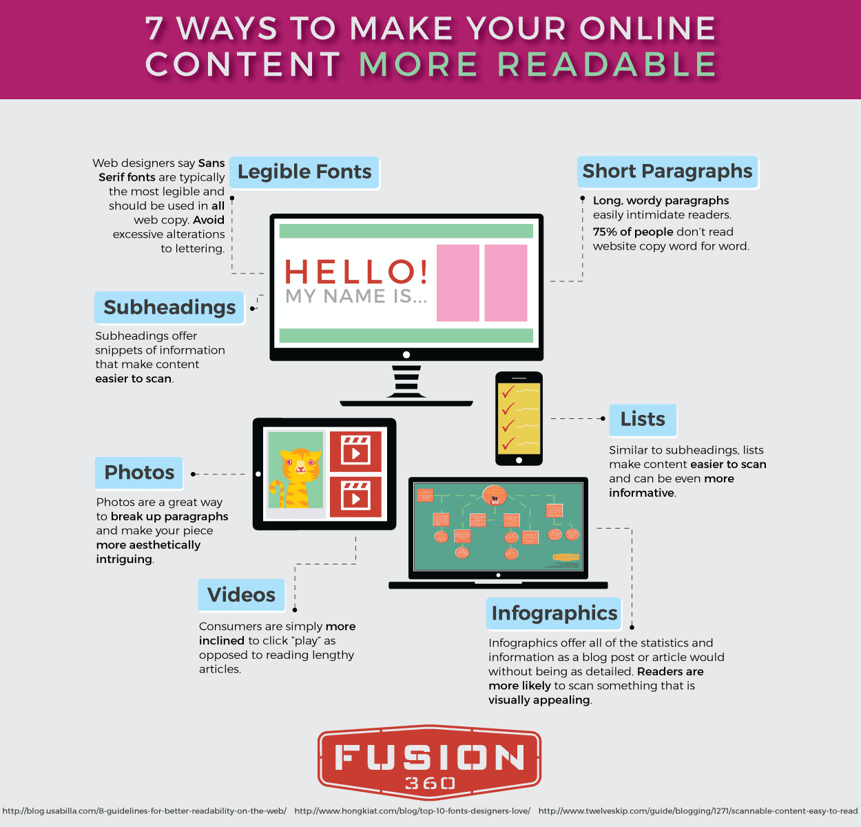
In order to make a website work for you, your respective clients and the World Wide Web’s most influential search engines, take the necessary time to make certain that content—particularly of a written nature—be readable, enjoyable and provide something of concrete value for site visitors. Still confused? The following infographic promises to simplify the tricky endeavor:

Fusion 360 - 7 Ways to Make Your Online Content More Readable (Fusion 360 SEO)

How to Manage Negative Social Media Comments

By | Social Media | No Comments

For social media marketing agencies all over the country, managing digital communities is just another part of the job. Whether it’s strategically starting a conversation on an industry-specific forum or using Audience Insights on Facebook to better understand what your target demographic desires, dealing with the mass amounts of social users can, after a bit of time, become a commonplace, comfortable affair.

That being said, regardless of the amount of time that you’ve spent as a social media marketer, dealing with negativity on any platform can be a troublesome endeavor. Making the matter even more difficult, you don’t represent yourself, but a client whose loyalty you’re trying desperately to gain.

However you handle marketing-related crisis, remember to take a deep breath, relax and respond appropriately. For more priceless help, check out the following points of emphasis which promise to make dealing with social marketing negativity an easier task:

Learn From What’s Taken Place

Negativity and harshness can be hard to deal with, even for the most seasoned of ad agencies. In real life, everyone has gone through situations in which they’ve been faced with public disapproval or a cutting comment. Even though social media is distanced in its interactions, the bravery with which people—all while hiding behind a selfie-centric profile picture—attack others is tremendous.

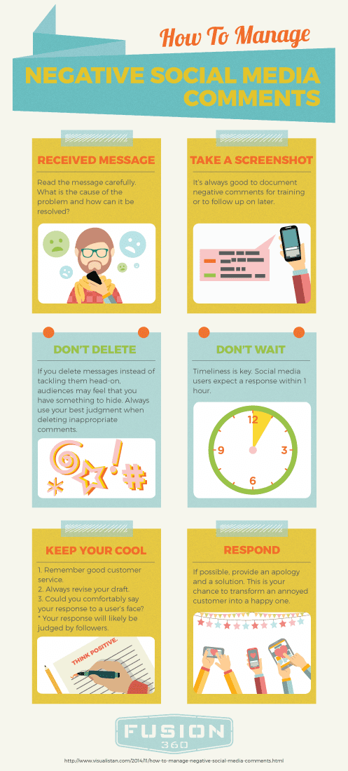
Instead of getting defensive by way of a few hateful backlashes, choose to read the comment in question a few more times. Try to see things from his or her perspective and think of how genuine help can be provided. Furthermore, it’s always a good idea to document negative comments for training or to follow up on later. Screenshots work perfectly for this and should be used accordingly.

Avoid the Temptation to Delete

There’s this crazy idea that once something’s been deleted, it permanently goes away. While the lunacy of such an ideology couldn’t be more apparent, when social media marketing and its respective agencies are involved, there’s an added level of naiveté. Countless are the stories of movie stars, musicians, athletes or common people who’ve been lambasted by something that they said weeks, months and even years prior through social media. Truthfully, that’s a heavy responsibility to have to deal with on a daily basis, but social marketing managers must find a way.

Needless to say, as opposed to immediately deleting a comment which unfairly casts a negative light on your client, choose to tackle the issue head-on, as top-tier agencies always do. Direct messaging options help to make this kind of resolution a private matter and can be extremely helpful.

With that in mind, from time to time, inappropriate comments will need to be deleted if profanity, racial slurs, explicit sexual content or anything else of the sort are put on display for all to see. At the end of the day, your best judgement will need to come into play to make the right decision.

Timeliness Can’t Be Understated

Any and all reputable marketing agencies understand the importance of deadlines. Without them, accountability ceases and clients opt for other industry competitors to handle their product- or service-pushing needs. In a similar fashion, social users—while unpleasant, from time to time—deserve to have their concerns addressed in a timely fashion.

In fact, studies have shown that, over the years, active social media enthusiasts have come to expect a response within only an hour of an initial engagement attempt. When comments are deleted or ignored by agencies, audiences may feel that something is being hidden from them. Simply put, the sooner a problem can be addressed, the better.

Respond In a Calm, Collected Manner

In an ideal world, all social interactions would be filled with glowing reviews and words of kindness. Seeing as how they aren’t, a change in perspective is often required to put a positive spin on things. Disparaging posts or tweets can’t be seen as an insurmountable obstacle; moreover, a way to transform an annoyed customer into a happy one.

Provide as much information as possible to help bring about a solution. Oftentimes, in certain scenarios, a special offer or outside email can make things right. In more extreme cases, if a complaint is genuine, help connect the miffed party with the best person to help them.

Regardless of who you are or how long you’ve been working at any one of America’s many marketing agencies, negativity is unavoidable; it’s never going away. Instead of turning the proverbial cold shoulder, ignoring the situation or making it worse through a series of harmful replies, take control and build your brand’s reputation with smart social practices.

Fusion 360 - How to Manage Negative Social Media Comments (Fusion 360 Agency)