The Alpha and Omega of Web Development

By | Utah, web development, website design | No Comments

Although almost every Website is different (or should be), the basics of the Web development process stays relatively similar. From the beginning phases of planning and gathering information through the end steps of development, testing and delivery, the Web design process involves several integral processes.

Research and Information Precedes Design

An appropriate amount of research must be done before the design process can begin; inadequate background information could result in a haphazard end product. As perhaps the most important aspect of the Web development process, research involves several different tangents. Before design and development can begin, the purpose and goals of the project must be completely designated. Is the purpose of the site to provide information? To sell a project? What are the goals of the site? After these items have been finished, you can identity your target audience and specify the type of content you want on the site.

Create a Design for Your Target Audience

After the initial planning and research phase is complete, it’s time to move onto the design portion of the Web development process. Perhaps the most important aspect of this step involves creating a design for your target audience. A retail site developed for younger audiences will have a much different design approach than a site targeting a financial planning audience. Whatever your target audience may be, your web design process should adequately reflect who you’re targeting.

Develop and Test for Different Browsers

Development immediately follows the design phase. Typically, the home page is designed first, immediately followed by an outline for interior/subpages. This template harbors the main navigational structure for your site — including the site map, page navigation and CTAs. After the development phase is complete, it’s time to move on to the testing and delivery phase. Before a site goes live, your Web designer will test the functionality of the site to ensure that all forms and scrips are functioning correctly, and will also test compatibility issues. This critical testing phase is done to ensure that the site can be viewed properly across a large range of different browsers.

The Psychology of Color in Web Design

By | web development, website design | No Comments

The color scheme on your website has the power to either adversely or positively affect visitors. With such a large color palette to choose from, how can you ensure that you select the correct color scheme for your target audience? Whether you’re a web development firm in Salt Lake City, Utah or on the East Coast, the rules of color psychology apply everywhere. Here are the basics that you need to know about color psychology and your target audience.

The_Psychology_of_Colors_in_Web_Site_Design_v1 (1)

Why You Should Update Your Cell Phone For the Sake of Mobile Developers

By | Mobile marketing, web development | No Comments

The worst thing that seems to happen when not updating or updating your phones iOS or OS is having an app crash on you, or have an app that isn’t supported by your current iOS or OS. Web development companies are on top of their apps, and will usually release them with the latest phone updates.

What Happens When You Update or Don’t

When updates do come to phones, Web designers and Web development firms are on top of getting their websites updated so that they will work with the latest version of Apple or Android. If you don’t update your phone, you may not be able to use apps you could before. Get the new app if it has been updated and load it up, as certain apps are updated for certain phones. And if your app decides not to work, go and check the app store and make sure there hasn’t been a recent update. If there has, that’s the app you want.

Updates on Your Apps

Apple has a place in their App Stores that allows mobile Web development firms to fix bugs and securities in their apps. Most updates are for this case, so if your app isn’t working properly on your phone, then you probably want to update your phone to the newest OS or iOS. The mobile developers create these updates to keep your apps up to date and working properly. Usually your apps will update by themselves, but make sure that the iOS and OS is going to be compatible.

Most mobile Web development firms don’t release the new versions of their app until the next phone update. Some will release their app for free for a short time, while they’re upgrading the usable app. This is usually to help with sales.

In the end the way to make yourself happy and the mobile developers happy is to update your phone when it needs to be.

Fit in With Your Web Development Friends: The Acronyms to Know

By | web development, website design | No Comments

There are so many words, codes and acronyms when it comes to Web development and design. When a web developer looks at you and says something in computer language, it really doesn’t make sense to an average person. So here’s some basics to help you have an almost human conversation next time you’re talking to a web designer.

AJAX
Yes, this is a big word, and an acronym for asynchronous (timing control), Javascript, and XML. AJAX is a cleaning product, but in the Web development world it’s a way to create dynamic web applications and allows for asynchronous data retrieval without having to reload a page.

Bandwidth
This basically is going to tell you how fast your data is going to transfer or the amount of data you’re going to be given. This is where you’ll usually hear kilobits per second or bits per second. So if you have a lower bandwidth you’re going to have a slower internet connection, while high bandwidth will give you faster connections like cable or fiber.

CSS
This is a web designers dream. CSS is what really controls the look of your website in accordance with HTML. CSS stands for cascading style sheets, and this will really help in designing your website. You can change colors and fonts with CSS as well as background images and other content.

Domain
This is your website — or, the way that your website is going to be identified. Web developers use this to associate with an IP address.

Elastic Layout
This also effects the way your website looks. Elastic layout helps Web designers use percentages and ems for widths pairs. Basically it uses this to change the layout of your website, the size, the layout and the ability to accommodate the browser width and font.
Web development and design doesn’t have to be complicated, but it can be a whole new language. The real way to look smart is to know the terms and to look like you know what you’re talking about.

How Mobile Marketing Is Capitalizing on Video Content and Geotargeting

By | digital marketing, Mobile marketing | No Comments

Before the Internet existed, news was read via newspapers; after newspapers, television became a supplemental news source. And with the introduction and explosion of everything-online, the Internet has become the newest primary method of news distribution. The catalogue of how news has evolved over the past 100-plus years speaks volumes in terms of how quickly major communication methods are changing.

Presently, digital marketing firms hold the torch in terms of relevant communication methods. And these agencies are spending a bulk of their resources focusing on what will be the future of advertising and communication: mobile.

Videos Have Advertisers Rethinking Mobile Strategy
With mobile communication taking over more rapidly than anyone in the 21st century could have anticipated, digital marketing firms and agencies are quickly adapting to construct advertising campaigns and methods that are congruent with the mobile takeover. One of the biggest advertising platforms that currently exist is video content.

Facebook, YouTube and similar publishers have long pushed video content. The marriage of video content and mobile devices has made digital marketing firms and agencies re-think the way they advertise within videos. The steady growth and eventual explosion of video content popularity has spawned an increase in programmatic technology and an inclination towards storytelling, rather than direct selling approaches.

Mobile GPS Systems Allow for Geotargeting
Advertising has long since jumped into the rabbit hole of personalized ads — and one of the more brilliant changes produced from this has been geotargeting (also referred to as geo-fencing). By using built-in GPS systems to their advantage, ad networks can pick out exactly where you are — which means they can then serve you a geo-specific advert based off of this information.

This is a win-win for consumers and ad agencies alike; mobile users are much more likely to click on an advertisement that offers services in their immediate vicinity. In return, ad agencies can collect more information about their customer base, thus creating campaigns that are geo-specific to not only your demographic, but to your personal preferences and retail history.

The Psychology Behind Clean Website Design

By | web development, website design | No Comments

Say two websites are selling the exact same service at the same rate. One website is a messy, difficult-to-navigate maze and features what appears to be a side navigation bar that hasn’t been updated since 1998. The other site — which again, sells the exact same service for the same price — has a clean website design, simple navigation and an appealing layout.

Upon which site will most people bestow their favor? Without a doubt, most end users will opt for the clean website design. Here’s a breakdown of the psychology behind why clean, simple site designs resonate more with end users.

The Science Behind Simplicity

A clean website design serves several purposes outside of its intended aesthetic appeal. An optimized micro white space (the minuscule area between letters and lines) not only looks better, but it also makes text easier for website users to read. Elegant simplicity also creates a positive, lasting first impression; this is critical for several reasons. Not only does a favorable first impression contribute to a lower bounce rate, it also creates a propensity for users to return in the future. A clean, sleek site layout that runs quickly and smoothly instills trust with the end user — coupled with a sense of luxury and efficiency.

Clean Navigation Increases Traffic and Revenue

In addition to creating a lasting impression on end users — specifically users who are visiting your site for the first time — a simple site layout with easy-to-use navigation increases onsite traffic and thus revenue. A site may sell a product or service for a lower price than a competitor; however, if end users can’t access a product, shopping cart or checkout due to a busy and confusing layout, the purpose of the site is ultimately defeated. Alternately, a site that’s easy to find, navigate and use will yield much higher statistics in terms of incoming traffic, revenue and positive consumer feedback.

The Evolution of Internet Website Design

By | Design, web development, website design | No Comments

Since the since website went live in 1991, the website has been an enduring staple of Internet activity. From static, text-based webpages rendered in black and white to the dynamic, highly-responsive websites we have today, both the design and applications of websites have changed immensely.

Let’s take a look back at how website design used to be, not all that long ago.

The Early Internet

What do the first websites and the dinosaurs have in common? By today’s standards, they were both rather primitive.

Life as a website in the early days of the Internet was a simple existence; 16 colors were supported by most computer monitors, but the early websites only needed three: black, white and blue for hyperlinks. For early websites, text was all you needed — images didn’t come into the picture until 1993. Textures came online later, in 1994. And don’t even think about using CSS — HTML was the only programming language in existence.

The Dark Ages

The Internet’s limited color palette got an upgrade in 1994-1995, from the original 16 to a whopping 256 colors. Web designers ran with the new color opportunity, unleashing an onslaught of obnoxiously bright, garish webpages and flashing neon advertisements (like the ‘70s, but for the Internet).

1995 and 1996 introduces PHP and CSS programming languages, which bring with them the opportunities for vastly improved website design. Unfortunately, Web designers in the late ‘90s were too busy filling their homepages with sparkly, animated aliens and those things that looked like Bratz dolls to take notice of anything besides HTML. Geocities reigned supreme. It was a dark time.

The New Millennium

The year 2000 brought with it fun things like gradients and colors that didn’t hurt people’s eyes quite as much. Also, fear of the Y2K bug. As websites become more complex, design changes to become more user-friendly, with a focus on menus and other navigation tools. Internet Explorer continues to gain ground on previous monopoly-holder Netscape, forcing web designers everywhere to optimize their websites for the ill-fated Internet browser.

The Awkward Teenage Years

Around 2003-2004, the Internet proliferates in an explosion of more subtle color options and Flash-animated activity. Splash pages are very in vogue around this time. As dial-up Internet begins to fade and cable and Wi-Fi are incorporated into more homes and businesses, the Internet becomes accessible to a wider range of people.

The Internet starts to figure out what it wants to be, bringing us early social media pioneers MySpace and “The Facebook,” blogging website WordPress and YouTube in 2005. Design-wise, people are intrigued by the concept of video and are continuing to make everything a little bit easier on the eyes. Cell shading is a big thing.

Internet Young Adulthood

Having more or less figured out what it wants to be, the now grown-up Internet spreads its wings and works on subtle improvements. Social media proliferates, YouTube becomes a legitimate website and Google makes the lives of people around the world a little less frustrating.

Drop shadows and more realistic imagery become popular as screen resolutions get better and better. Color schemes are a thing. People are really into scrolling. Responsive design becomes more important.

Present Day

With a wealth of programming languages and design tools, today’s websites are more responsive and customizable than ever. Web designers have a multiplicity of options, a huge array of possibilities — and yet the prevailing trend is minimalism.

Aesthetically pleasing fonts are widely available, high-quality images are in abundance and animated GIFs and videos can be embedded every place imaginable. Most importantly, Internet Explorer is finally dead. Now if only people would pay their Web designers more, I’d say we’re living in an Internet renaissance.

3 Ways Social Media Should Influence Your Website Design

By | Social Media, web development | No Comments

It’s no secret that social media has radically altered the world. From the way we communicate with friends to the way businesses attempt to sell their products and services, social media has had a significant impact on the digital landscape. And while much of the world’s attention has been on social media’s societal impact, there’s no denying that social media has also had an influence on website design.

A recent article from Upstart Business Journal noted that social media’s storytelling methods have also influenced what consumers value in a website design, citing innovations such as responsive Web design and user-generated content as being directly influenced by social media practices. And while these tools have certainly had an impact, it’s certainly not every business that is looking to have user-generated content populating its site.

However, there are several other lessons from social media that can be applied to a company’s website design as well. Here are a few important ones to be aware of.

Visual Storytelling

As mentioned in the article from Upstart Business Journal, social media’s prominence has made the Web a much more visually-oriented place. One needs only take a look at popular social media platforms like Instagram and Snapchat (which are completely built around images), as well as the popularity of sharing photos on Facebook to see that visual storytelling is more important than ever in the digital space.

When it comes to website design, companies are no longer well served by simply presenting visitors with page after page of thick text. While it is important for companies to still provide valuable information through text, if there aren’t engaging images to bring the company’s story to life, it is unlikely to garner much attention from consumers.

In addition to making Web content more interesting to site visitors, images can also be used to present information in a more shareable format. Infographics, in particular, can serve as a more engaging method of providing pertinent information while also contributing an interesting piece of content that is more likely to be shared on social media.

Transparency

Social media has also led customers to expect a higher degree of transparency from companies, political groups and other organizations. While you should be making an effort to be transparent in your social media efforts (such as responding to complaints and other feedback), a company website is another great place to showcase a company’s commitment to transparency.

It doesn’t take much to include background facts about your company, or even information about some of the people that work there, but these snippets of information can be quite important—especially for business-to-business companies. Many professionals wish to get a more firm understanding of the background of a company and its leaders when deciding whether or not to work with it. Including this information when planning your website design makes it easier for potential clients to make an informed decision.

Brief bios for company leaders (or even a brief overview of a company’s history) also provides a great opportunity to showcase your expertise and success. For example, if your CEO has received several industry awards, including this information in a bio page can increase customer confidence and trust, especially when it comes to making a business-to-business purchase.

New Content

It can be very tempting when creating a website to simply slap up a design that contains some basic information and a contact form, but social media has trained users to expect regular updates from friends and companies alike. After all, a social media profile that never posts might as well not exist at all.

And in some ways, this attitude has also affected modern websites. It seems that almost every new site—regardless of industry—incorporates some type of blog. And this is for good reason. Blogs have been found to be highly effective, in some cases increasing lead growth for small businesses by 126 percent when compared to companies that don’t have a blog.

And much like on social media, it’s not just any random update that will do. Taking the time and effort to craft well-researched, quality blog posts not only gives site visitors stronger incentive to continue browsing, but it also sends signals to Google and other search engines that your site is an authoritative source for industry information. As a result, a regularly updated and well-maintained blog not only improves customer relations, but it also can provide a solid SEO boost.

Conclusion

There should be little doubt that social media will continue to influence website design and other digital media best practices. Businesses large and small would do well to adopt these trends to ensure continued digital success.

8 Website Design Mistakes You Don’t Want to Make

By | web development | No Comments

When it comes to the world of website design, there’s plenty of good, bad and ugly work to be found on the Internet. And if you want your site to be an attractive, SEO-friendly workhorse that consistently drives new customers to your business, then you certainly need to use the right design strategies.

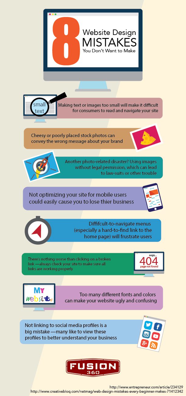
Unfortunately, there are plenty of design mistakes implemented online every day. While some are only minor annoyances, others can make your site truly awful and cause some serious business losses. The following infographic takes a look at some website design mistakes you absolutely do not want to make.

Fusion 360 - 8 Website Desing Mistakes You Don't Want to Make (Fusion 360 Web Development)

Internet Usage and Mobile Interfaces

By | web development | No Comments

These days, be it here in Utah or elsewhere, you needn’t be seated at a computer to access the Internet.

Instead, many college students, stay-at-home moms and working professionals of all types opt for their smartphones as a means through which they get their respective digital fixes.

That said, there’s more to what users want than simply ease of accessibility from the web development teams that serve them. Does your mobile site deliver?