The Evolution of Internet Website Design

By | Design, web development, website design | No Comments

Since the since website went live in 1991, the website has been an enduring staple of Internet activity. From static, text-based webpages rendered in black and white to the dynamic, highly-responsive websites we have today, both the design and applications of websites have changed immensely.

Let’s take a look back at how website design used to be, not all that long ago.

The Early Internet

What do the first websites and the dinosaurs have in common? By today’s standards, they were both rather primitive.

Life as a website in the early days of the Internet was a simple existence; 16 colors were supported by most computer monitors, but the early websites only needed three: black, white and blue for hyperlinks. For early websites, text was all you needed — images didn’t come into the picture until 1993. Textures came online later, in 1994. And don’t even think about using CSS — HTML was the only programming language in existence.

The Dark Ages

The Internet’s limited color palette got an upgrade in 1994-1995, from the original 16 to a whopping 256 colors. Web designers ran with the new color opportunity, unleashing an onslaught of obnoxiously bright, garish webpages and flashing neon advertisements (like the ‘70s, but for the Internet).

1995 and 1996 introduces PHP and CSS programming languages, which bring with them the opportunities for vastly improved website design. Unfortunately, Web designers in the late ‘90s were too busy filling their homepages with sparkly, animated aliens and those things that looked like Bratz dolls to take notice of anything besides HTML. Geocities reigned supreme. It was a dark time.

The New Millennium

The year 2000 brought with it fun things like gradients and colors that didn’t hurt people’s eyes quite as much. Also, fear of the Y2K bug. As websites become more complex, design changes to become more user-friendly, with a focus on menus and other navigation tools. Internet Explorer continues to gain ground on previous monopoly-holder Netscape, forcing web designers everywhere to optimize their websites for the ill-fated Internet browser.

The Awkward Teenage Years

Around 2003-2004, the Internet proliferates in an explosion of more subtle color options and Flash-animated activity. Splash pages are very in vogue around this time. As dial-up Internet begins to fade and cable and Wi-Fi are incorporated into more homes and businesses, the Internet becomes accessible to a wider range of people.

The Internet starts to figure out what it wants to be, bringing us early social media pioneers MySpace and “The Facebook,” blogging website WordPress and YouTube in 2005. Design-wise, people are intrigued by the concept of video and are continuing to make everything a little bit easier on the eyes. Cell shading is a big thing.

Internet Young Adulthood

Having more or less figured out what it wants to be, the now grown-up Internet spreads its wings and works on subtle improvements. Social media proliferates, YouTube becomes a legitimate website and Google makes the lives of people around the world a little less frustrating.

Drop shadows and more realistic imagery become popular as screen resolutions get better and better. Color schemes are a thing. People are really into scrolling. Responsive design becomes more important.

Present Day

With a wealth of programming languages and design tools, today’s websites are more responsive and customizable than ever. Web designers have a multiplicity of options, a huge array of possibilities — and yet the prevailing trend is minimalism.

Aesthetically pleasing fonts are widely available, high-quality images are in abundance and animated GIFs and videos can be embedded every place imaginable. Most importantly, Internet Explorer is finally dead. Now if only people would pay their Web designers more, I’d say we’re living in an Internet renaissance.

Product Placement in Hip Hop & Rap

By | marketing, Music | No Comments

While Beyoncé’s shout out to Red Lobster in “Formation” was hard to miss, product placement in rap & hip hop music is often more subtle — but no less pervasive. From Run-DMC’s influential track “My Adidas” and Golden Age hip-hop’s fascination with Cristal champagne to Jay Z’s incessant name-dropping of fashion designer Tom Ford, marketing agencies got nothing on hip-hop’s biggest artists when it comes to clever and persistent product references.

From luxury cars and Air Jordan sneakers to chain restaurants and brands of fancy alcohol, check out these blatant brand product endorsements from both big-name rappers and lesser-known acts alike.


fusion_rappers

Can’t-Miss Steps of an SEO Audit

By | SEO | No Comments

SEO audits are notorious for being time and labor-intensive. There are numerous ways to improve your website’s SEO — from high-authority backlinks to properly-optimized images and website URLs. While an SEO audit can go in different directions depending on a business’ needs, there are some things an SEO audit simply can’t do without.

Mobile First

It’s 2016, and mobile is king — if your website isn’t mobile-friendly by now, you’re going to have a bad time. From Utah to the East Coast, Americans can’t get enough of mobile Internet; 75 percent of Americans now bring their phones with them to the bathroom. Start by taking Google’s mobile-friendly test, utilize a mobile sitemap and Accelerated Mobile Pages (AMP) and put a focus on responsiveness.

Data, Data, Data

This is SEO we’re talking about, so data is huge; performing an SEO audit means going through Google Analytics, AdWords data and Webmaster Tools, to name a few. All this data gives you insight into cost metrics, conversion rates, useful keywords, traffic metrics and more. Need to know how much traffic comes in from Utah, the West Coast or from other websites? You got it. Without the support of hard data, your SEO audit will go nowhere.

Tackle 404 Pages and Duplicate Content

You know what good websites don’t have? Error pages and duplicate content. Eliminate or redirect error pages as needed and get rid of duplicate content as soon as possible; duplicate information doesn’t look good to Google, much less to your users.

A Fast Website is a Good Website

Slow loading times can kill Web traffic: not only will users hate you, but search rankings will be negatively affected as well. Run PageSpeed Insights tests, enable browser caching and enable compression to reduce space. And as for any reputable website, finding a good Web host is absolutely essential.

SEO audits are a complicated business, and with all the little details it can be easy to miss the forest for the trees. Whether you’re a small business in Utah or a larger corporation, focus on these essential steps to make your next SEO audit a rousing success.

Mobile Internet Use Around the World

By | digital marketing, marketing, Mobile marketing, web development | No Comments

In an increasingly global marketplace, marketing companies and digital advertising agencies around the world are devising methods to reach diverse audiences from the flat landscapes of Utah to the mountains of the Himalayas. With landlines and reliable access to electricity available sparsely in many locations, more and more people are turning to mobile as their primary method of Internet access — as are those in more developed nations.

As mobile grows in global popularity, marketers need to increase their mobile presence accordingly — or risk missing out on potentially lucrative opportunities. Take a look at these mobile Internet statistics and demographics and get a leg up on the mobile marketing game.
Mobile-Around-the-World

Content Marketing: Fact Vs. Fiction

By | advertising, content marketing, digital marketing, marketing | No Comments

Content marketing is easy, right? All you have to do is write a couple of blog posts, choose a few stock photos and call it a day, right? Wrong. From Utah through the Midwest, there are a plethora of myths surrounding how content marketing works. Some of the key attributes of this niche marketing genre require client to consumer trust, strategic brand investment and a healthy relationship with social media outlets.

Whether you’re believe old wives’ tales about re-spinning content or buying into the idea that marketing and advertising are one and the same, here’s the real scoop on fact, fiction and theory when it comes to content marketing.

Content-Marketing-Fact-Fiction

Inside the Beautiful Mind of a Content Marketer

By | advertising, content marketing, digital marketing, marketing | No Comments


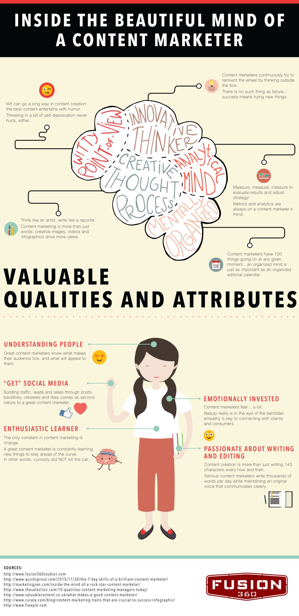
The occupation of content marketing is uniquely different from other marketing occupations. Throughout Utah to the Midwest, the creative job description of a professional content marketer requires the mind of an artist coupled with the writing style of a reporter. By perpetually trying to think outside of the box, the content marketer must not only possess a keen sense of wit, but he or she must simultaneously be mentally organized and innovative.

As artists who are as passionate about AP Style as they are about the Oxford Comma (or lack thereof), finding a great content writer requires a unique simulation of particularly-curated character qualities. Here’s the breakdown on what makes or breaks a good content marketer.

fusion_contentbrain